VictoriaLand Beauty’s CyR.U.S. System is a tactile solution making beauty packaging and products accessible for blind and partially sighted consumers. Using raised symbols and embossed QR codes, consumers can navigate VictoriaLand’s portfolio through touch and audio information on the product type, usage, and ingredients.
We spoke with Victoria Watts, founder of VictoriaLand Beauty, about the importance of accessible cosmetic packaging.
The overdue accessibility of personal care
Watts founded VictoriaLand with the idea of creating a brand centred on natural, vegan, and cruelty-free ingredients – “like many indie beauty brands,” Watts notes. But when Watts learned that her youngest child, Cyrus, was born with Familial Exudative Vitreoretinopathy (FEVR), a hereditary disorder that can cause vision loss or blindness, her focus changed.
“As I watched Cyrus navigate his unsighted world every day, I worried, how will he bath or shower himself? How will he manage doing the simple, everyday tasks we take for granted?” Watts recalls of the time after Cyrus’ diagnosis.
It was during this time that Watts “became determined to offer visually impaired customers the same ability to experience and enjoy beauty and personal care as my sighted customers.” Watts quickly realised that “for people with any degree of vision loss, everyday activities we take for granted – like identifying a product or reading a label – hamper your independence, enjoyment, and safety”.
Within the personal care and cosmetics space, in particular, “judging a product by touch can be difficult, as many packages are generically shaped without tactile markings”. For example, shampoo and conditioner, two similar items with different functions, are often available in identical bottles that cannot be told apart by touch alone.
Watts felt that blind and partially sighted consumers had “virtually been ignored when it comes to product accessibility”, forcing them “to make do or do without the beauty [products] that we take for granted”. According to Watts, there is an assumption that blind and partially sighted consumers don’t spent money on beauty products. “I believe that the ability to look and feel beautiful and creatively express yourself is a universal right,” Watts states.
This led to “years of research and conducting focus groups”. During the process, Watts ruled out Braille: “While Braille is a beautiful and amazing language, […] only around 10% of the visually-impaired population reads it.” On top of this, cosmetic packaging offered its own set of challenges. “Braille occupies a lot of space, which is at a premium on beauty product packaging,” Watts explains. In some cases, two words could equal a sentence in Braille. “What’s more, existing Braille solutions are bulky and hard to master.”
Working with the Lighthouse Foundation was, for Watts, “instrumental in providing me with incredible insights on what the visually impaired community needed to enjoy independence”. Watts adds that her work with a blind man from the foundation led to the discovery of “how valuable QR codes could be” and “the importance of embossing them so they can be easily identified”, demonstrating how significant packaging design would be in making VictoriaLand’s products accessible.
A straightforward system with a big impact
Watts’ research and personal experience was ultimately the “inspiration” behind the CyR.U.S. System, “the first – and only – modern tactile language designed to give the 2.2 billion people worldwide who have some degree of vision loss” a safe and empowering experience of beauty products.
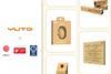
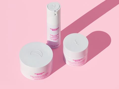
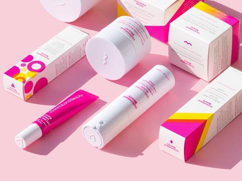
The CyR.U.S. System is “comprised of a library of raised symbols plus QR code technology that provides easy product identification through touch and audible product information with a simple scan to all users”. Named after Watts’ son, CyR.U.S. is also “an anagram for Universally Raised Symbols”.
“The symbols are intuitive (think emojis) so they can be learned by anyone instantaneously,” Watts explains. The symbol of night cream, for example, is a crescent moon, while exfoliator is represented by a circle with small lines and dots inside. Where symbols are similar, there are nonetheless distinct variations that give clear guidance to consumers, such as one teardrop for face oil and two teardrops for serums.
This was important not only because of the number of blind and partially sighted people who cannot read Braille, but also because “Braille can take as long ass 4-6 months to master”. In addition, “each CyR.U.S. symbol is optimised for touch with the right height and thickness for easy reading”. Therefore, CyR.U.S. provides a solution that is also accessible from the perspective of the time and skills needed to understand it.
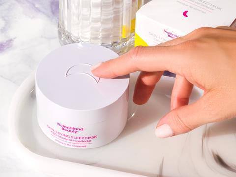
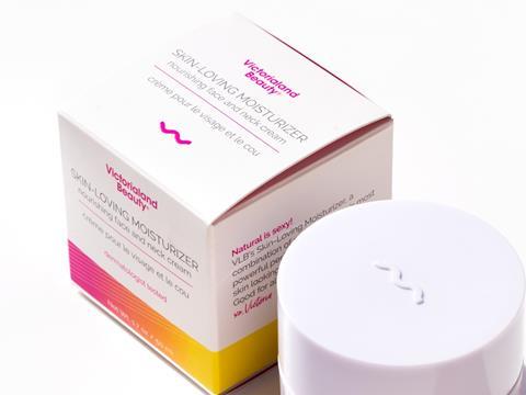
Watts adds that “each QR code is embossed to allow for easy identification to scan using a smartphone.” In connection with a screen reader application, this gives auditory descriptions of the product and instructions for use. Importantly, this allows blind and partially sighted consumers to pick products based on their ingredients – an important factor in for a more personal experience of beauty and cosmetics – and to ensure that products do not contain any allergens.
For Watts, accessible packaging design offers an enhanced experience for all consumers while continuing to centre blind and partially sighted people. “It boosts brand value and supports inclusivity,” Watts says. “Because it’s based on the principles of Universal Design, beyond benefiting those who are diagnosed as blind or significantly visually impaired, CyR.U.S. offers a better experience for many other groups.”
Watts identifies older, dyslexic, or autistic people as just some of the consumers who might have a more positive experience with beauty and cosmetic products using the CyR.U.S. System. In addition, for consumers whose first language is not English, Watts notes that the company is aiming “to offer audible product information in all languages” in the future.
According to Watts: “Universal Design is based on the belief that by designing products for special needs first, those products work better for everyone else regardless of age, size, ability or disability and might in fact inspire new ideas that don’t ordinarily exist.”
What’s next?
“My goal is to make CyR.U.S. universal by 2025,” Watts states. “In order to do that, we need to enlist as many brands as possible.”
It seems that a shift in the perspective of the beauty industry – which Watts says is already beginning to “advocate for inclusivity” – is needed to truly “break down barriers” and include disabled consumers. As Watts notes, “that requires awareness, education, technology and training.
“Most importantly we need to enable every brand – regardless of size, budget, staffing and skills – to participate in CyR.U.S. by providing the right tools tailored to their individual business reality.”
In the future, Watts is also hoping to expand the applications of the CyR.U.S. System: “To further accomplish this, we will be developing CyR.U.S. symbols for many other categories include household goods, food and beverages, and CPG. Stay tuned.”