


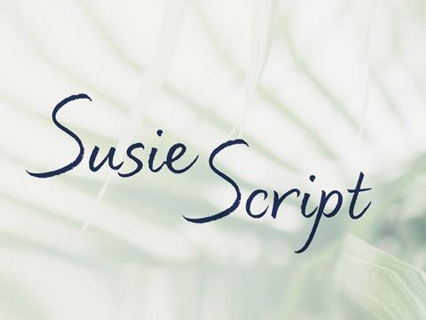
Brand design agency Lewis Moberly recently worked with Tropic Skincare to develop a new script typeface intended to be accessible especially to dyslexic and neurodiverse consumers. The typeface, Susie’s Script, combines readability with a dynamic design that mirrors handwriting for Topic Skincare’s packaging and website.
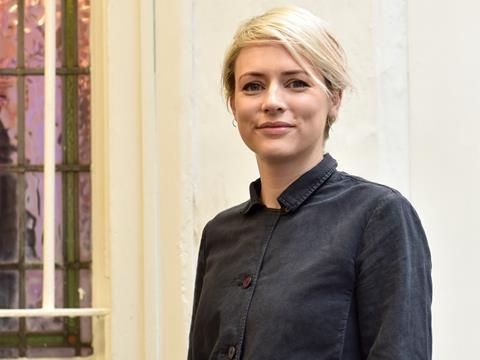
Emily Fox, creative director at Lewis Moberly, talks us through the development of Susie’s Script and how to balance accessibility with brand aesthetics.
The importance of accessible packaging design
Founded in 1984 by Mary Lewis and Robert Moberly, Lewis Moberly is “a strategic creative business, immersed in the world of brands” that has worked with Bailey’s, Häagen-Dazs, Johnnie Walker, Selfridges, and Gatwick Airport, among others.
Lewis Moberly recently worked with Tropic Skincare with the aim of designing a bespoke typeface that is accessible for people with dyslexia and other neurodiverse consumers. While Fox claims “life is gradually becoming more inclusive with disabled access in public places through to functions that help the visually impaired navigate more easily”, she acknowledges that packaging accessibility continues to lack in some cases.
“Even those with average eyesight and dexterity can experience issues with packaging,” Fox explains, “Whether it is being able to physically open a pack or instructions being so small they’re barely legible.” For neurodiverse consumers, it can be even more difficult “to see the wood for the trees” when it comes to the deluge of visual information sometimes presented on packaging.
It is well-known that Sans Serif fonts are more accessible as their Serif counterparts include decorative elements that can distract the eye and brain from the overall shape of the letter or cause the word to blur around the edges in digital formats. However, brands may have a preference for more unique or embellished fonts on packaging where the goal is to stand out on the shelf and entice the consumer with a limited canvas.
Fox suggests that “most typefaces designed for the neurodiverse lack character”, which is often antithetical to the purpose of packaging design, especially for segments like cosmetics where Tropic Skincare sits. Yet 25% of workers in the beauty industry are dyslexic, as suggested by research from Lewis Moberly, pointing to the need to ensure that products are accessible not only to consumers but also to those that are designing, producing, advertising, and selling them.
In addition, as Fox says, neurodiverse consumers “still want and deserve to have our information expressed with verve and drama”. This led Lewis Moberly to develop Susie’s Script, named after Tropic Skincare’s founder, with the aim of combining aesthetics with accessibility.
Making accessibility consistent with branding
According to Fox, “our challenge was to create a handwritten typeface that could be easily read on all Tropic products and communications – where it may sometimes appear against a more complex backdrop. We were constantly testing and refining the script to ensure legibility, whilst not compromising on its expressive design.”
Susie’s Script features “well-spaced open letterforms and considered textured irregularities” that allow the font to be accessible for neurodiverse readers. The typeface was specifically developed in the script style, which provides the inspiration for its handwritten appearance enhanced by the addition of several alternative versions of the letter. “This makes for a beautiful, approachable and dynamic typeface,” says Fox.
“Susie’s Script brings pleasure to those who find reading a challenge, and also in fact to anyone else. It unites clarity and our beautiful disparities. Irregular textures bring character. You can feel meaning when reading is sensorial — a comprehensive pleasure.”
Another design element mentioned by Fox is that the typeface may appear against potentially complex backgrounds, such as the textured and colourful packaging of Tropic’s skincare products, or the images of nature used to frame the products on the brand’s website. Therefore, the typeface needed to fit aesthetically with Tropic Skincare’s existing branding while retaining its accessibility where backgrounds can sometimes complicate reading experiences.
Lewis Moberly appears to have successfully incorporated this consideration into the final design of Susie’s Script with the use of colour and spacing. Susie Ma, founder of Tropic Skincare, adds that the typeface “sits beautifully within our current branding, resonating perfectly with our overall core values around inclusivity”.
The typeface will now be rolled out across Tropic Skincare packaging, as well as on its website.
What’s next?
“We hope Susie’s Script will lead a standard in legible messaging without compromising on aesthetic,” Fox tells us. “We are conscious with every project we work on that we must ensure accessibility for all. Be it packaging, animation, web design or comms, by taking this approach we can improve the experience of a brand for everyone no matter what their diverse needs may be.”


No comments yet