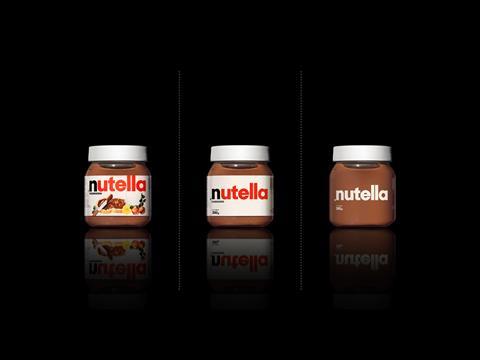
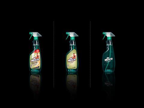
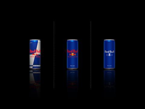
In 2010 Mehmet Gözetlik (co-founder and executive art director of Antrepo) released images of familiar branded goods stripped of the ‘visual noise’. The project went viral, in the process shaking the design world and eliciting a profound emotional response from millions of consumers. With the benefit of seven years’ hindsight Mehmet talks to Tim Sykes about the ideal of minimalism in a maximalist market – and is as passionate as ever about rescuing the human psyche from data overload.
Tim Sykes:
What was the starting vision behind the ‘Minimalist effect in the maximalist market’ project?
Mehmet Gözetlik:
Today we live in a new world with Facebook, Twitter, Instagram and Google. We check our emails with iPhones, and read books on iPads or Kindle. A tech company Microsoft (as you know, they are not a pharmaceutical company) is working on the cure for cancer. We are talking about AI, VR, AR, etc. We're producing artificial organs and talking about immortality. We're going to Mars to expand humankind's habitat. We're working on the Asteroid mining. We're driving electric cars and some countries will completely ban petrol powered cars in a few years. So our environment has changed and is changing rapidly in progress. But when I looked at the supermarket, I felt like they didn’t reflect spirit of our era and I would like to ask to other people on this project. Do we need an update on the packaging? or not?
TS:
Did you always prefer the minimalist version of the brand? Can we draw any conclusions about when minimalism is more or less effective? For example, is visual noise necessary when it’s a children’s product or when you need to get across lots of information as well as brand appeal?
MG:
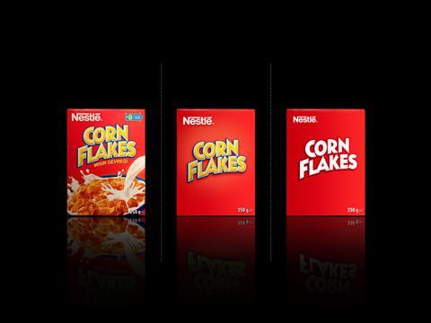
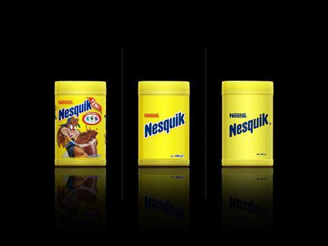
Actually, minimalism is not a visual style anymore in the big data age. It involves digging through the depth of the complexity. Yes, some people responded that "this approach doesn't work for Pringles, Corn Flakes or Nesquik." But I don't agree with them. This was not a design proposal. I just asked a question through some visual illustrations, in a world becoming more simplified in the very near future, which side will you be more prone to? Are you in favour of ‘silence’ by saying ‘less is more’? Or do you love hundreds of varieties of sauces screaming ‘Buy me! Buy me!’? In my view the answer is that we strongly need an update about every part of our lives.
The project pointed out the obvious necessity of minimalism for the 21st-century persona who is getting crushed under the weight of waves of information. For instance, if we produce a new packaging for Nesquik, we need to make a detailed research about kids, their technology, environment, etc. What information is essential for their parents now? By radically simplifying the information on the product, the solutions based on mobile technologies can be endorsed. Showing less and giving more information via new technologies such as AR, iBeacon could generate superb consumer experience.
TS:
…So augmented reality and other digital extensions of the physical package or label might further accelerate the minimalist trend. The object itself doesn’t necessarily have to fulfil the communication function in the way that it used to. Do you see the packaging design of the future being driven by technology?
MG:
The Wright Brothers used the most common and essential materials to humankind for flying: fabric and wood. Which means Ancient Egyptians could have been flying if it had been approved by the religious faiths. It wasn’t until the beginning of the 20th century that religious beliefs were set aside for progress. Then a phase of passionate human discovery commenced on and beyond the Earth. We climbed mount Everest, we invented all kind of airplanes, discovered new species in new places like north and south poles, dared to leave Earth and set foot on the outer space, on the moon…
As this simple example highlights, innovation isn’t necessarily linked to new ideas but rather is associated with a new way of thinking. New ways of thinking lead to the discovery of hidden perceptions, solutions for better opportunities and most importantly for a better life for all. That’s why the people outside the system generate innovation. Our future can be surprisingly shaped by anyone’s unpredictable effect. For instance, Elon Musk’s irrelevance within the automotive or aerospace sectors doesn’t stop his inspiration to radically shape the automotive industry and future of space technologies.
So even though important progress has been leading production technology, today’s packing approach is so much like NASA’s space programme with similar design formulas and resistance to change in certain perspectives. However, it is an absolute necessity to move towards a world with ‘Space-X’ empowered by innovative approaches. For such progress, an R&D project with a multi-disciplinary approach, integrating design and engineering and led by the innovation, can be developed.
TS:
It seems to me that since 2010 a number of brands have moved towards simplicity just as you anticipated. How do you perceive the influence of the project in the real world?
MG:
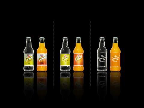
The project contributed to minimalism by raising global awareness. When major brands such as Starbucks and Target simplified their logos, mainstream media outlets like adage.com and the Washington Post linked the strategic simplification move with my project. In same year, the project was publicised at the Shanghai Design Triennale in a group exhibition called ‘The Reason for Design Emotion’, side by side with the work of creatives such as Naoto Fukasawa, Zaha Hadid, Ross Lovegrove, Marc Newson, Norman Foster and Philippe Starck.
TS:
Have you been involved in any extensions of the work that started in ‘Minimalist effect in the maximalist market’?
MG:
The minimalist project was an inspiration for the ‘No Noise’ campaign by British retail giant Selfridges in 2013. During the exclusive campaign, the simplified products from major brands such as Heinz, Levi’s, Beats by Dre and Marmite were put to sale on a conceptual shopping spot called ‘The Quiet Shop’.
After seven years we’re still talking about the project in this interview. A couple of the global consumer packaged goods brand owners, including Unilever, have contacted us to help develop a new approach based on our project. We have created many works which has same up-to-date design philosophy. We are working for one at the moment to help create a better tomorrow.
TS:
What is your broader philosophy about the key to good packaging design?
MG:
You need only one thing for a good design: a problem. A problem that needs a serious solution. In other words, your roadmap brings you to good design. You have to be a designer as well as an innovator, as an explorer, not as an ornament maker or visual artist. It should be human-centred, not functionally focused only.
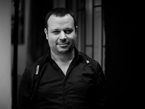
Co-founder and executive art director of Antrepo, a collective platform, Mehmet Gözetlik works as an artist and designer in Istanbul and teaches design entrepreneurship at Bilgi University. He attends national and international conferences to explain the global connotations of his projects and share his ideas about future needs including TEDx Talks, Garanti Managers Summit, International TypeCon conference, and Open City Forum.

