


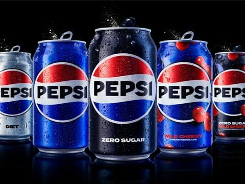
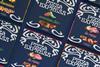
To celebrate its 125th anniversary, Pepsi will update its logo across its packaging and other physical and digital touchpoints for the first time in 14 years – intending to pay homage to the brand’s history while anticipating its future.
An updated logo and visual identity system will roll out in North America this autumn, with a global shift scheduled to take place in 2024. It will feature a new, ‘bold’ typeface alongside the combination of the Pepsi globe and watermark and an updated colour palette – introducing electric blue for contrast, vibrancy, and a ‘contemporary edge’ to the traditional colour scheme, while also retaining and emphasising its shades of black to represent Pepsi’s commitment to Pepsi Zero Sugar.
Furthermore, while it will introduce a can silhouette in reference to the 125-year history of Pepsi’s packaging, the brand will maintain its signature pulse design to replicate the “ripple, pop and fizz” of Pepsi-Cola and the rhythm and energy of music.
The redesign aims to capture Pepsi’s ‘most unapologetic and enjoyable qualities’ through packaging, fountain and cooler equipment, fleet, fashion, and dining. To keep up with developments in the digital space, it will implement movement and animation into its visual system; this is also expected to facilitate ‘seamless and creative collaboration’ with retailers and partners by reaching consumers in various physical and virtual environments, from retail shelves to the metaverse.
“At PepsiCo, we design our brands to tell a compelling and holistic story,” said Mauro Porcini, SVP and chief design officer of PepsiCo. “Pepsi is a shining example of a brand that has consistently reinvented itself over 125 years to remain a part of pop culture and a part of people’s lives.
“We designed the new brand identity to connect future generations with our brand’s heritage, marrying distinction from our history with contemporary elements to signal our bold vision for what’s to come.”
“Pepsi is an iconic brand that is constantly evolving with the times, as it has been a staple in pop culture and disrupted the category for the past 125 years,” added Todd Kaplan, chief marketing officer at Pepsi. “We couldn’t be more excited to begin a new era for Pepsi, as this exciting new and modern look will drive brand distinction to show up bigger and bolder and help people find new ways to unapologetically enjoy the things they love.
“This new visual system brings out the best of the Pepsi brand’s rich heritage, while taking a giant leap forward to set it up for success in an increasingly digital world.”
In similar news, Nesquik has also unveiled a three-dimensional reimagining of its mascot, Quicky, with the aim of maintaining brand relevance in the digital age and bringing the product to a wider range of audiences. The updated brand identity will be visible on Nesquik’s packaging and in its digital marketing.
Another soft drinks brand, 7UP, also updated its own branding for the first time in seven years, implementing ‘zesty citrusy tones’ into its green packaging and rolling out a multi-touchpoint campaign across static, motion, and digital assets.


No comments yet