


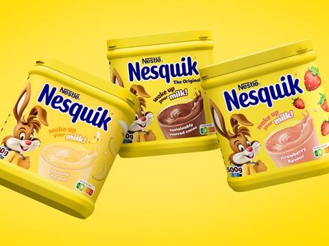
Nesquik is reimagining the role of its mascot in a partnership with FutureBrand to modernise its brand identity, aiming for relevance in the digital age and growth into new audience segments.
Centering around Quicky, Nesquik’s rabbit mascot, the rebrand aims to meet shifting consumer priorities by positioning the character as ‘an ally to parents’ in promoting a nutritious diet, active lifestyle, sustainable habits, and positive thinking amongst children.
As well as its goal to fit Quicky into evolving roles within the modern family, the new branding aspires for relevance and longevity by implementing him into a digital environment – aiming to widen the appeal of its branding to a range of audiences beyond on-pack assets, such as taking its marketing to social media in pursuit of engagement from teenage consumers.
FutureBrand is said to have drawn inspiration from animated films and the gaming industry to create a motion-led, three-dimensional version of the mascot with a new appearance, outfits, and postures. This is coupled with a new, simplified packaging design that aims for a bold and immediate shelf presence while ensuring easy consumer navigation.
A new, bespoke typeface known as NESQUIK Sans has also been designed to express fun and playfulness in line with Nesquik’s intended image, with the digitally edited milk splash on the packaging aspiring for the same effect.
Soft drink brand 7UP recently unveiled its ‘comedic’ shift in brand identity in the first major overhaul of its branding in seven years, constituting redesigned packaging and a multi-touchpoint campaign.
Landor & Fitch also worked with Starbucks last year to produce a new design for its ready-to-drink chilled coffee portfolio in an effort to build ‘stronger emotional connections’ with consumers and develop distinctive branding for the company.


No comments yet