


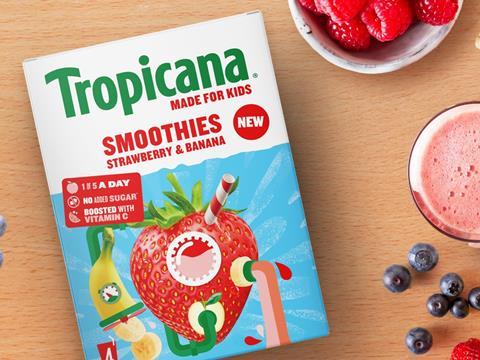
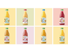
STORMBRANDS has developed a new packaging system and updated the branding for Tropicana’s Kids Smoothies range, intending to appeal to both children and parents.
Searching for differentiation from its market competitors, Tropicana approached its strategic brand design collaborator STORMBRANDS to create a ‘fun, reassuring and distinctive’ brand and packaging identity that responds to key motivators for its target audience. This involved balancing gestures towards ingredient quality, nutrition, and sustainability for adult consumers with a ‘cool’ and ‘engaging’ design for kids.
Photographs of real fruits and Tropicana’s ‘iconic’ straw are printed on the outer carton alongside credentials like ‘1 of 5 a day’, ‘no added sugar’, and ‘boosted with vitamin C’. This is expected to appeal to parents as the primary consumer of the multipack boxes by signifying the pack’s natural ingredients.
On the other hand, ‘personality-led’ messaging and fun facts such as ‘mandarins can get sunburnt’ and ‘a pineapple is actually a berry’ seek to prompt conversations amongst children at lunchtime.
Tropicana also seeks to expand its brand relevance from a breakfast drink to a product that can be consumed at any time of day. As such, the pack has been designed for an easy fit into packed lunches, enabling young consumers to take the drink to school.
“We’ve created a brand architecture and packaging system that’s strongly aligned to Tropicana’s iconic core identity, which is synonymous with quality, taste and natural fruit,” explained Zoe Phillipson, creative director at STORMBRANDS. “But we’ve also developed a new system with appeal and credibility as a parent-purchased but child-focused range. It accommodates the needs of both perfectly.
“Parents like to choose products that are naturally healthy from brands with trusted reputations. Kids want brand experiences that are fun, exciting and make them look cool in front of their friends.
“STORMBRANDS has satisfied both audiences with a distinctive identity. The results catch Mum or Dad’s eye in the supermarket, and provide showing-off creds for the kids.”
In a related development, Nesquik joined forces with FutureBrand to evolve its brand identity. By reimagining the role of its mascot, Quicky, it hopes to find new relevance in evolving family roles and the digital age, as well as taking advantage of the digital landscape and social media to appeal to a teenage audience.
Cobra Beer also seeks to connect its product to Pan-Asian cuisine and increasing consumer interest in spicy food with its own visual rebrand.
If you liked this article, you might also enjoy:
The L’Oréal approach to packaging sustainability
What steps is Apple taking to make its packaging more sustainable?
How did Brazil achieve its 100% aluminium can recycling rate – and can it be replicated in the EU?
Experts have their say on the EU’s Packaging and Packaging Waste Directive revisions


No comments yet