


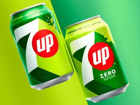
In the first major overhaul of its branding in seven years, 7UP is redesigning its bottles and cans to coincide with the new, ‘comedic’ shift in its brand identity.
The new visual identity system will maintain the green colouring of previous designs while implementing ‘zesty citrusy tones’ for additional vibrancy. A multi-touchpoint campaign is set to debut across static, motion, and digital assets starting next month, with the brand rolling out its first consumer engagement platform across its international activations this spring.
7UP states that it aims to bring ‘moments of UPliftment, positivity and surprise’ to consumers with its new, comedic branding, falling under the slogan ‘New Get Up, Same 7UP’. The rebrand is expected to begin in European and Latin American markets alongside the UK, USA, Ireland, Pakistan, Saudi Arabia, Bangladesh, India, China, and Egypt.
“UPliftment is a concept that resonates with people globally,” explained Mauro Porcini, SVP and chief design officer at PepsiCo. “Our new visual identity for 7UP was inspired first and foremost by the brand’s creation of moments of UPliftment throughout its history.
“The PepsiCo Design & Innovation Team created a bright and confident visual identity system that will echo across cultures, regions, and languages. The new 7UP features the brand’s signature punchy green, but with added citrus hues and distinct high-contrast lines that portray a feeling of upward energy.”
Eric Melis, vice president of Global Brand Marketing at PepsiCo, added: “We’re excited to shine a light on our international positioning and reveal our visual identity system to the world. 7UP has always provided people with refreshing UPliftment through consumption and that’s why it feels like a natural fit for us to drive this narrative forward and center UPliftment within everything we do.”
Landor & Fitch recently helped Starbucks to redesign its ready-to-drink portfolio for chilled coffee products and build ‘stronger emotional connections’ between its drinks and its consumers; it also worked with Kellogg’s to develop a new aesthetic for its snacks range to affirm its brand identity and on-shelf appeal.
Mars Wrigley’s Celebrations brand also underwent a packaging redesign in a bid to encourage consumers to purchase its products all year round, not only at Christmas.


No comments yet