


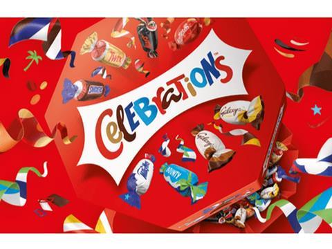
Mars Wrigley brand Celebrations has rebranded its packaging in an effort to encourage consumers to view the confectionery as a choice all year round, not just at Christmas.
Brand agency Taxi Studio, who collaborated with Celebrations on the new design, say the brand was being overshadowed by its constituents, and it saw the need to bring Celebrations into its own identity to drive more equity into the brand. The agency adds that by modernising it and making it more progressive, Celebrations hopes to find relevance with a younger audience who are increasingly engaging with brands in the digital world and want excitement and diversity of product.
The company states it translated the familiarity of each chocolate into a visual language, using iconised depictions of the wrappers to unify the brands and create a more streamlined look, with the Celebrations master brand mark as the focal point.
Ryan Wills, CEO and founder at Taxi Studio, comments: “Celebrations, by definition, is about being bold in marking a festivity or occasion, so this brand expression needs to communicate and evoke this feeling through every touch point. The interaction with the brand and box is an opportunity to remind consumers of the universality of festivities.”
This change to Celebrations packaging is part of several rebrands this year: last month Princes Group’s Branston Beans saw a redesign in partnership with The Brand Nursery, and Gentlebrand removed labels and introduced embossing for Korea Crystal Beverage’s Montbest water brand.


No comments yet