


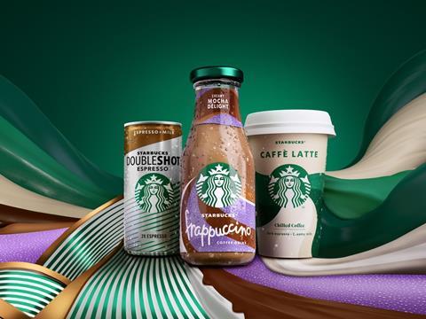
Starbucks has collaborated with Landor & Fitch to redesign its ready-to-drink portfolio for chilled coffee products, aiming to facilitate distinctiveness for the brand and build ‘stronger emotional connections’ with the drinks amongst its consumers.
Landor & Fitch’s Insights & Analytics team reportedly consulted a study of 2500 consumers across Europe, the Middle East and Africa (EMEA) and led the creative direction of a new campaign thought to ‘celebrate the in-between moments’ of an average day.
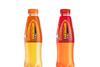
Claiming to prioritise simplicity and vibrancy, the redesign aims to avoid conventional design choices made in coffee packaging, including a beige colour theme and images of coffee beans. The fresh colourway continues to implement Starbucks’ signature green colouring with the intention of maintaining brand block ambition; for example, it is switching the lids of its Frappuccino Chilled Coffee bottles from gold to green and drawing more attention to the brand’s siren mascot.
At the same time, it reportedly aims to build variation within the portfolio, and makes use of existing flavour codes in various textures and shapes – intending to create a ‘stronger emotional connection with consumers and to reinforce each product’s distinct benefits’.
The new designs will be applied to Starbucks’ Frappuccino packaging, as previously mentioned, and will also incorporate its Chilled Classics coffee cups and Doubleshot Espresso cans.
“We were thrilled to be chosen as the trusted creative partner for Starbucks chilled coffee,” said Ryan Shaw, executive creative director at Landor & Fitch. “We upheld high standards at every step to ensure the relaunch’s 360-brand experience delivered on the original ambition, working in sync with the wonderful Starbucks team who encouraged us to push boundaries and be extraordinary.
“The power of creativity trumped the limitations of working remotely during the pandemic, demonstrating a new level of collaboration that can be achieved when teams are passionate about the work.”
“After establishing the chilled coffee category over a decade ago, it was time to reassess our brand’s distinctiveness,” adds Charlotta Oldham, marketing director, EMEA at Starbucks. “Working closely with Landor & Fitch across the entire journey, we are delighted to launch the Starbucks Ready-to-Drink refresh and reassert our position as the leading brand of choice in the EMEA RTD category. We have taken bold ownership of the Starbucks green and showcased our Siren against the brilliant new coloured textures to forge a greater emotional connection with our customers.”
Landor & Fitch recently collaborated with Kellogg’s to redesign the packaging of its snack range to solidify brand identity and increase the products’ shelf appeal.
Earlier this year, Starbucks trialled a returnable cup programme in Europe, in which customers could purchase both cold and hot drinks in a reusable cup with a £1 deposit and receive the money back when they brought the cup back to stores to be cleaned and reused.
Back in 2019, Gaya Gold Coffee unveiled a new metal can design for its luxury iced coffee, gaining popularity with consumers in the United Arab Emirates.


No comments yet