


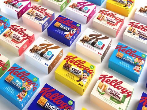
Kellogg’s has launched a new look for its snacks range, designed in collaboration with Landor & Fitch to affirm brand identity and on-shelf appeal.
According to the companies, an analysis of Kellogg’s share of the breakfast category identified an opportunity for the Kellogg snacking range, which previously demonstrated a lack of brand block on shelves, non-uniformity in its packaging sizes, and a powerbrand-led design that apparently meant it was not standing out as much as it could.
Landor & Fitch therefore worked to develop a new identity for the snack range with a more consistent appearance aimed at increasing presence in the snacking aisles of shops and supermarkets. The brand transformation company says that they developed a more coherent relationship between Kellogg’s masterbrand and powerbrands through a balanced naming and branding hierarchy.
The new design involves a bold crop of the masterbrand Kellogg’s logo sitting at the top of the packaging, with the powerbrands’ assets elevated and centred underneath to ensure strong product representation and recognition, the companies explain. The companies add that while the colour of each product box is set to the powerbrand variant colour, the recognisable red Kellogg’s logo is consistent across each box to offer a coherent look and easier navigation of the portfolio on-shelf.
In addition, on the new packaging, each bar is pictured as ‘ripped open’ to reveal shots of the snack bars within, apparently to demonstrate food appeal and enhance their on-the-go quality while optimising the use of the limited space on the pack. Overall, the companies say the redesign is aimed at emphasising Kellogg’s reputation for on-the-go snacking options.
The roll-out has started across markets including UK & Ireland, Benelux, France, Italy, Portugal, Spain and MED. The launch will be highlighted through the Kellogg to Go multibrand campaign across digital, in-store media and socials.
Landor & Fitch previously rebranded Kellogg’s cereals in 2019, which saw it awarded by the Grand Prix Stratégies du Design, Pentawards, and Brand Impact. Kellogg’s has also begun the rollout of accessible cereal boxes featuring a unique on-pack code that consumers with sight loss can scan with a smartphone to access labelling information.
Tristan Macherel, global executive creative director at Landor & Fitch, comments: “Working within Kellogg’s design process, we developed a new and balanced design system for a very complex brand hierarchy across its snacks portfolio. The refresh positions Kellogg as the bold leader in snacking, reclaiming and reinforcing its iconic status while also celebrating each product.
“Our continued collaboration on packaging design with Kellogg is testament to the unique passion and push for the extraordinary from both of our teams, right across Europe. We look forward to seeing the snacks on shelves soon.”
Niamh Cribbin, Europe marketing manager at Kellogg, adds: “We saw the success of our cereal rebrand in 2019 and wanted to bring the learning and results from that into our snack range. We wanted to move from the established designs to make the range more edgy but without losing brand recognition which helps our consumers to spot them on shelf.
“We know people love, connect and engage with our brands and we wanted to make it easier for them to do that, which is why we’ve updated the entire portfolio at once. The exciting, modern design has been tested with consumers with overwhelmingly positive results and I can’t wait to see them take over shelves across Europe.”


No comments yet