




Coca-Cola’s major new packaging rebrand has been generating plenty of discussion over the past week, but how will consumers respond to it? In a recent conversation with Fernando Arendar, founder at Nitid Studio, we took a look at the iconic brand’s new visual identity through the lens of buying decisions, unintended brand associations, and neuropackaging.
What was your immediate reaction when you saw Coca-Cola’s new visual identity for the first time?
My first reaction was that this was clearly an optimization exercise. It looked like an attempt to make the Coca-Cola identity more consistent, more unified, and more systematized across markets and formats, while keeping the brand’s most iconic assets intact.
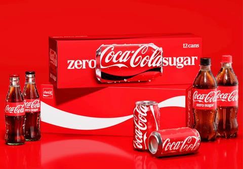
But interestingly, my first contact with the new packaging was not through the official case study or through the press. I first saw it on TikTok. Someone had posted a picture of Coca-Cola Zero Sugar saying that it was now almost impossible to tell apart from regular Coca-Cola.
I remember taking a screenshot of the video and doing an image search, because I honestly thought it might be fake. It felt strange to me that a brand like Coca-Cola would reduce the difference between regular Coke and Coke Zero Sugar to that degree.
So my immediate reaction was mixed. On one hand, I saw a very coherent brand system. On the other hand, I immediately saw a potential consumer confusion problem.
And when you took a closer look at the packaging and the reasoning behind the rebrand – what were your thoughts?
My thoughts did not change that much, because I usually try not to focus too much on the rationale behind branding projects.
Of course, the rationale matters for the team that created the work. But the consumer doesn’t see the strategy deck and doesn’t read the internal explanation. The consumer sees the pack, often in a very fast, distracted, low-involvement moment.
So I try to look at this kind of project less from the point of view of a branding person and more from the point of view of a consumer.
The first mental connection that came to me was Marlboro. What triggered that association was the white lettering in the new typeface on a red background. At first, I was not sure if that association had only happened to me. But then I saw other people making the same connection.
And that is important. You can explain the typography, the heritage, everything, but certain associations are instant and involuntary.
That is why brands need to pay attention to these mental triggers. A design does not only communicate what the brand intends to say. It can also activate memories and associations from other categories or other brands.
The designers behind this move have describe this project as a “doubling down, not a rebrand”. What’s the thinking behind this from the brand’s point of view?
I agree that this is probably not a rebrand in the traditional sense. But honestly, I do not think the label matters that much.
Whether we call it a rebrand, a refresh, or “doubling down,” the more important question is how consumers receive it and how it affects brand perception, product recognition, and sales.
From the brand’s point of view, I understand the thinking. Coca-Cola is one of the most familiar brands in the world. When you have assets that people know by heart, the temptation is not to reinvent everything, but to make those assets work harder.
So the idea seems to be to make Coca-Cola even more Coca-Cola. And more consistent across markets and touchpoints.
That makes sense strategically. But the risk is that when you apply that idea too literally across the portfolio, you may strengthen the master brand while weakening the shopper’s ability to quickly separate one variant from another. For me, that is the bigger consumer question behind the project.
Please could you give us some insights into the neuropackaging-related parts of this redesign? What are the new designs trying to achieve in that sense?
From a neuropackaging perspective, I think the redesign clearly understands the power of familiarity.
For a brand like Coca-Cola, familiarity is not a small thing. It is a huge asset. The red, the script, the ribbon, the bottle shape, these are cues that have been built in consumers’ memory for decades. So keeping those assets makes sense.
I also noticed that in some flavor extensions, they are using more visual ingredient cues, such as lemon or cherry illustrations. That taps into something very simple but very powerful: the picture superiority effect. People tend to recognize and remember images more easily than words. In packaging, showing the ingredient can help the brain identify the flavor faster and with less effort.
Where I think they may have gone too far is in reinforcing the Coca-Cola codes across the whole line. The theory is good. Keep the brand recognizable. But if taken too literally, it can reduce differentiation within the portfolio.
The most problematic case, in my view, is Coca-Cola Zero Sugar. The new design seems to overestimate how much mental energy a shopper is willing to spend during a routine purchase.
People do not always shop carefully. They shop distracted. They shop while thinking about something else. So if regular Coca-Cola and Coca-Cola Zero Sugar look too similar, it becomes easier for shoppers to pick the wrong one by mistake.
And that creates what I would call a confusion cost. The consumer may feel frustration, or even a small sense of betrayal, when they realize they picked the wrong product. The brand made the choice harder than it needed to be.
But there is also a bigger issue that I have not seen many people discuss, which is sugar. For some consumers, this is not only about taste preference. Some people, for example people with diabetes, cannot or should not consume sugar. And confusion could also happen in bars, restaurants, events, or homes, where someone else is serving the drink.
So this is not just a design clarity issue. It can become a safety and liability issue. I’m not sure the risk has been fully understood yet.
Let’s say you were put in charge of a new project to completely overhaul Coca-Cola’s brand identity. What would you do?
I would probably do something quite close to what they did in principle.
I would not try to reinvent Coca-Cola from scratch. That would be a mistake. The brand has some of the strongest memory structures in the world, so I would protect the iconic assets.
I would also lean into what researchers Alicia Kulczynski and Margurite Hook call vintage anemoia. It refers to that attraction to a past you may not have lived personally, but that still feels emotionally rich and familiar. And I think Coca-Cola did some of that in this relaunch. Coca-Cola has a lot of permission to use those heritage cues because the brand is deeply connected with cultural memory.
But I would be very careful about two things:
First, I would avoid design choices that activate strong associations with other brands or categories. The Marlboro connection is a good example.
Second, I would not make regular Coca-Cola and Coca-Cola Zero Sugar look so similar that people have to stop and double-check. This is not just about design. For some people, the sugar difference really matters, whether because of habit, preference, or health reasons.
So my approach would be to make the master brand stronger, yes. Use the iconic assets, yes. But never at the expense of clear variant navigation. A strong brand system should make the portfolio easier to shop, not harder.
If you liked this story, you might also enjoy:
The ultimate guide to packaging innovation in 2026
Packaging and Packaging Waste Regulation: what to know in 2026
Everything you need to know about global packaging sustainability regulation














No comments yet