


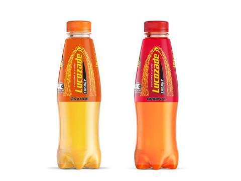
Lucozade is rolling out a new packaging design for its Orange and Original drink flavours, featuring more transparency in its sleeve to give consumers a preview of the product and indicate its flavour, taste, and refreshment.
The change responds to input from 6,500 consumers and eighteen months of extensive research and development, and is accompanied by updated recipes for both drinks – implementing a “bolder” taste for the Original flavour and a “more citrusy, orange note” for Orange.
According to consumers, the new sleeves will increase the chances of shoppers noticing the product on the shelves and encourage them to purchase the product. They will be implemented across all Lucozade Energy Orange and Lucozade Energy Original 380ml, 500ml, and 900ml bottles, both for individual sale and in multipacks; the remaining Lucozade Energy flavours are also set to adopt the new packaging in the near future.
New marketing plans will also be unveiled in the coming weeks, says Lucozade, which is expected to attract new consumers and help drive retailer sales.
This development also fits into Suntory Beverage & Food GB&I’s Core Brand Innovation programme, created by its parent company Suntory to prototype and test new solutions with the viewpoints of consumers emphasised in the process.
“Core brand innovation is at the heart of our approach to brand building,” says Zoe Trimble, head of Lucozade Energy, Suntory Beverage & Food GB&I. “We believe across our business that brands must evolve to keep up with changing consumer needs.
“Our thorough process involves extensive research and agile prototyping with consumers and leans heavily on successful techniques developed by Suntory our global parent company. The goal is to better understand the lives of our consumers, what they’re looking for and what drives their decision making, so we can adapt our brands to meet their needs – delivering a win for our consumers and our customers.
“We are excited to be launching this new taste and look for Lucozade Energy Original and Orange and are confident the bold new flavours and design will help us reach even more shoppers.”
Heineken Enterprise has applied Ardagh Metal Packaging’s H!GHEND printing technology to its Pélican craft beer cans – implementing a new design to encourage consumers to flip the pack and improve the drink’s flavour.
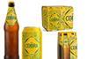
Cobra Beer’s visual rebrand, meanwhile, aims to connect the drink with Pan-Asian cuisine and encourage consumers to drink the beer with spicy food.
If you liked this article, you might also enjoy:
McKinsey on whether or not on-pack sustainability claims affect consumer spending
A deep dive into the most important packaging sustainability trends and solutions


No comments yet