


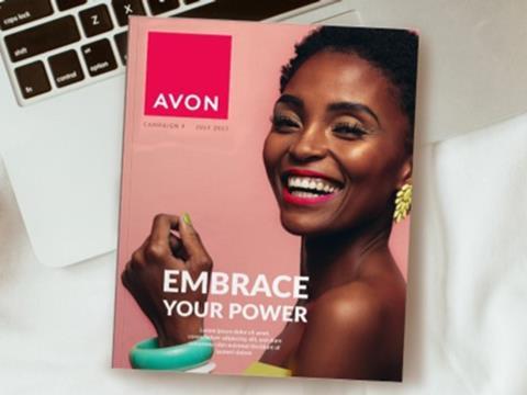
Avon has worked with creative agency Free The Birds to update its packaging design and create a new, female-positive visual identity to match its new brand positioning.
An audit of Avon’s global positioning revealed that the brand’s identity had become inconsistent between different platforms. Free The Birds recommended a branded house approach, which involves a single cohesive strategy with one visual identity for all of Avon’s applications and brand channels.
As well as completing the initial brief of upgrading Avon’s packaging design, the collaboration has resulted in a new hallmark logo, website, and social media assets. A new brand colour, primary typography, photography style, advertising layouts, brand guidelines, and the personality of its visual branding have become brand equities.
The hallmark is positioned in a plinth shape with an ‘iconic power pink’ colour. As well as reflecting Avon’s previous ties to breast cancer awareness, this colour aspires for optimism, boldness, and mobilization.
Furthermore, it is a nod to Avon’s ‘Embrace Your Power’ brand positioning, which was launched by Wunderman Thompson earlier this year. As a whole, the visual identity seeks to reflect Avon’s stance that ‘every woman is born with her own unique power’.
Dalton Maag also worked with Free The Birds to develop the new Avon typeface, which sought to maintain brand recognition by resembling the original logo while balancing the letter forms to refine the font.
The rebranding campaign is currently being rolled out across Europe, the Middle East & Africa, South and North Latin America, and Asia Pacific territories.
Nick Vaus, partner and creative director at Free The Birds, explained: “Avon is an iconic beauty brand with true purpose on a global scale. But like all heritage brands it needs to stay relevant and that requires purposeful transformation.
“It became very obvious very quickly the power and potential a total brand identity refresh would unlock. Partnering with the team at Avon to engage with this new look and feel has been a truly wonderful experience.”
“Our unique value proposition for customers is the personalized beauty services and advice by someone in their community who really knows and understands their needs,” added Kristof Neirynck, CMO at Avon. “The aim with this rebrand was to celebrate Avon’s USP in the market which has always focussed on creating products that help our customers feel the best version of themselves.
Working with Free The Birds allowed us to bring the Avon brand in line with this bold level of multi-channel transformation, and we’re thrilled with the outcome of the collaboration on this project. The brand now matches the energy and empowerment that Avon brings to our employees, Representatives and our customers.”
In another branding upgrade, Cobra Beer sought to connect its product with Pan-Asian cuisine to match increasing consumer interest in spicy foods.
Nesquik also collaborated with FutureBrand to modernise its brand identity for the digital age and expand into new audience segments by updating the role of its mascot, Quicky.
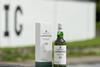
Other packaging redesigns include Lucozade’s new, more transparent sleeves for its Orange and Original drink flavours and Scotch whisky Laphroaig’s new design in line with Beam Suntory’s aim to achieve net zero carbon emissions across its value chain by 2040.
If you liked this article, you might also enjoy:
The L’Oréal approach to packaging sustainability
What steps is Apple taking to make its packaging more sustainable?
How did Brazil achieve its 100% aluminium can recycling rate – and can it be replicated in the EU?
Experts have their say on the EU’s Packaging and Packaging Waste Directive revisions


No comments yet