McDonald’s recently teamed up with Pearlfisher to rethink its packaging design, with a focus on aesthetic minimalism. We talked with Matt Sia, creative director at Pearlfisher, to get the inside story on the rethink and assess its importance to McDonald’s’ wider brand.
Could you introduce the rebrand to us and unpack some of its key features?
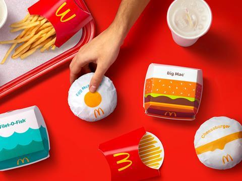
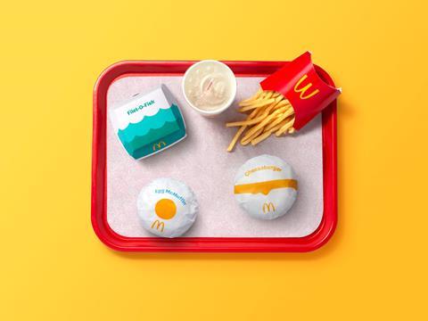
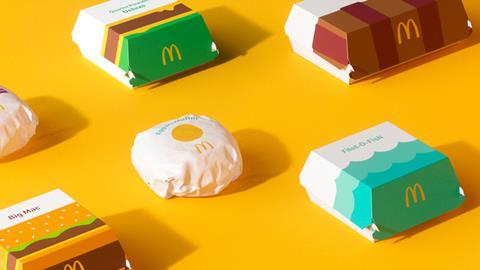
Our focus in partnering with McDonald’s was on redesigning their global system of packaging. What we created is a system led by thoughtful, colourful illustrations of every menu item. Transitioning from a design system with prominent on-pack messaging, the graphic representations of menu items help make each of the structures more connected and evocative of McDonald’s’ playful point-of-view.
No matter the combination of each unique order, from the cool, blue waves on the Filet-O-Fish clamshell or the golden, melting cheese on the Quarter Pounder with Cheese clamshell, the packaging makes for an expressive, visual system.
From McDonald’s’ perspective, what was the reasoning behind the rebrand?
The packaging redesign is part of a broader brand evolution. With so much fresh and new at McDonald's – from smart kiosks to menu innovations – it made sense for the global packaging to change in step with the direction the brand is taking.
We took into consideration how we could support the renewed brand identity to foster a feel-good experience that works around the world. No matter the region or language, we wanted the packaging design to communicate joyful moments while being immediate and universal.

What feelings did you want to convey with the new packaging?
We were very excited to have the opportunity to design the innate joy of the McDonald’s brand back into the packaging by allowing each unique menu item to speak for itself. The packaging became a creative space to showcase the specialness of the menu and the brand.
What we created is about delighting customers. It’s about bringing them into the playfulness of the McDonald’s brand through the packaging, while also providing the crew with a design system that is easy to navigate and work with, no matter where you are in the world.
The new look you’ve created seems to favour a more minimalist style, which is a trend that we’ve seen proliferating in brand design over the past few years. In your view, in the context of branding as a whole, what has motivated this trend?
A sense of ease and simplicity for consumers should be a goal for all brands. With McDonald's, we focused on what felt the most fitting for their personality – what felt the most natural. This is what led to the joy and simplicity of the graphic expression, rather than being driven by style or trend.
It's important for every brand to represent itself in a unique and truly special way, considering the details – especially when the expression is stripped back to its most personable form. The full family of products looks confident and simple now, but it’s because a lot of thought and consideration went into each item.

Above and beyond striking a chord with consumers, we’ve read that another purpose of these design changes was to help McDonald’s employees work more efficiently. Could you break this idea down for us?
While it is playful, the new McDonald’s packaging is easy to understand and easy to navigate. This was important not only for resonating with customers around the world, but also to ensure that the redesigned packs didn’t add any new complexities for the crew assembling orders in restaurants.
The graphics-led system we created is identifiable on every wrap, clamshell, carton, and pack, making continued efficiency a guarantee, not a possibility.
How does this packaging rebrand fit into McDonald’s’ overall brand refresh?
This new packaging redesign lives seamlessly with the brand identity, as they were created in parallel over the course of four years. The point-of-view and principles hold true across every menu item to make way for a cohesive system that is aesthetically connected, functionally immediate, and emotionally uplifting.
Consistency through visual language from brand identity to packaging is key – especially for a brand as universal as this – and we were able to design a joyful, simple way forward for McDonald’s’ global system.
For more news and insights from the packaging design space, take a look at our sister publication, Touchpoints.


