


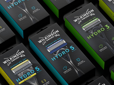
Creative agency B&B studio has teamed up with Wilkinson Sword to rebrand and restructure its shaving and grooming portfolio – a move anticipated to differentiate the products from others of their kind on the market.
Working to a new brand positioning, ‘The Blade Masters since 1772’, inspired by the brand’s history and sword-making origins, B&B studio began the project by recrafting Wilkinson Sword’s double sword logo. The new design moves away from the existing flat and one-dimensional graphic, introducing greater depth to the swords and modernizing the logo’s typography – including reworking the Ws.
Four different ranges have been introduced across the brand’s shaving and grooming products. With different SKUs available in different markets, B&B says it was essential to create an ‘overarching family feel’ for the design, achieved by using black as a core brand colour across all ranges, and using colour blocking, layout and typography to differentiate ranges, and variants within each range.
A simplified communications system has also been introduced, with clearer product naming, universal iconography, and a consistent hierarchy. Wilkinson Sword’s Hydro range is the first of the new designs to launch onto the market, with further ranges to follow.
“Tackling the Wilkinson Sword portfolio has been an incredibly rewarding challenge,” comments B&B design director Jack Gibbons. “It is a privilege to partner with a brand so rich in heritage, and the new look emphasizes the brand’s genuine quality and expertise in a cluttered marketplace.”
In similar news, Avon worked with creative agency Free The Birds last year to update its packaging design and create a new, ‘female-positive’ visual identity to match its new brand positioning. The collaboration resulted in a new hallmark logo, website, and social media assets.
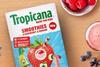
STORMBRANDS developed a new packaging system and updated the branding for Tropicana’s Kids Smoothies range. Photographs of real fruits and are printed on the outer carton alongside credentials like ‘1 of 5 a day’, ‘no added sugar’, and ‘boosted with vitamin C’, expected to appeal to parents by signifying the pack’s natural ingredients. ‘Personality-led’ messaging and fun facts such as ‘mandarins can get sunburnt’ and ‘a pineapple is actually a berry’ seek to prompt conversations amongst children at lunchtime.
If you liked this story, you might also enjoy:
How are the top brands progressing on packaging sustainability?
The ultimate guide to global plastic sustainability regulation


No comments yet