


Campari recently launched a refreshed design for its iconic Aperol bottle. In a recent conversation with Design Bridge and Partners Amsterdam, the design agency that created the new pack, we discussed the key features of the new bottle, Campari’s motivations behind updating such a well-known product, and how they aimed to balance heritage with a modern look-and-feel.
Let’s start with a top-down view: please can you introduce this new design to our readers and give them some more information on the key changes to the iconic Aperol bottle?
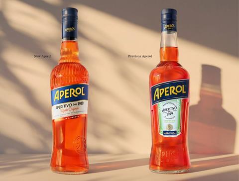
Redesigning the iconic Aperol bottle presented a unique opportunity for our team at Design Bridge and Partners Amsterdam to evolve one of Italy’s most recognisable brands while staying true to its rich heritage. The new design celebrates the brand’s unmistakable Italian spirit and sociability.
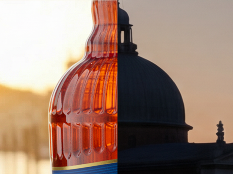
The bottle silhouette and shoulder details are inspired by Italian architecture, while the rippled glass is a tribute to the Venetian tradition of glassmaking.
Several key design elements were refined to strengthen brand recognition and elevate the bottle’s premium appeal. The embossed Aperol logotype has been redrawn, and repositioned to increase shelf impact, while the iconic slanted shoulders have been enhanced to reinforce the bottle’s distinctive silhouette. The liquid itself remains the hero, with the new label allowing the bottle to showcase Aperol’s vibrant orange colour.
We partnered with well-known typographer Alec Tear, to redraw the original founder’s seal. The Barbieri brothers’ seal features on the label as well as embossed directly into the glass. This creates a meaningful connection to the brand’s founding in 1919 and reinforces the authenticity at the heart of Aperol’s story.
Sustainability was also a key consideration throughout the redesign process. The new bottle has a reduced glass weighting and a reduction of plastic within the cap.
It’s a bold decision to redesign such a well-known, high-impact bottle – what was Campari’s thinking behind this move, and what were some of the key objectives?
For a brand with Aperol’s global recognition, redesigning the bottle was never about reinvention, it was about evolution. Campari Group’s ambition was to maintain the brand’s recognition while strengthening its relevance for the future generations of consumers.
The key objective was to elevate the bottle’s premium credentials and improve visibility in an increasingly competitive Spritz category. As new brands continue to enter the market, reinforcing Aperol’s distinctive visual assets became essential to maintaining category leadership while creating a more contemporary and confident expression of the brand.
Another important objective was to tell a richer brand story. Aperol’s heritage, craftsmanship, and Italian provenance are among its greatest strengths, and the new bottle brings these elements to life through thoughtful details embedded in the bottle structure and label.
Ultimately, the goal was to create a bottle that feels unmistakably Aperol while deepening the emotional connection consumers have built with the brand over generations.
What did Campari’s brief look like – were there any specific elements they wanted to include or avoid in terms of content and style?
Campari’s brief focused on establishing what the brands stand for and how we can stand out. The redesign needed to capture Aperol’s Italian heritage and leadership within the aperitif category while remaining instantly recognisable to consumers around the world.
Together we established which distinctive brand assets are fixed, and which could flex. The iconic bottle silhouette, the vibrant orange liquid, the signature 11-degree logo angle and the colour palette all define Aperol’s distinctive identity and status as a symbol of Italian aperitivo culture.
At the same time, the brief sought to elevate storytelling around the brand’s origins and craftsmanship, creating stronger emotional connections through details that consumers could discover. Importantly, the brief was not about following short-term design trends. The objective was to create a contemporary design that was timeless, not timely.
The design needed to feel authentic to Aperol’s history, avoiding unnecessary complexity or decorative elements that could distract from the brand’s iconic simplicity.
Could you give us a look into the redesign process from conception to delivery? What were the biggest challenges that had to be overcome?
The redesign process began with extensive research into Aperol’s history, design heritage, and cultural significance. The team at Design Bridge and Partners explored archival materials, analysed previous bottle iterations, and identified the visual assets that consumers most strongly associate with the brand.
Our Amsterdam team were able to visit the Venetian region, with the Aperol client team, to see where Aperol was created and immerse ourselves in the provenance and culture first hand, which is quite rare these days!
From these insights, the Design Bridge and Partners team developed a series of design territories that explored different ways of expressing Aperol’s heritage, elevated positioning, and contemporary relevance. These concepts were refined through close collaboration with the Aperol client team, balancing creative ambition with technical, manufacturing, and sustainability requirements.
One of the greatest challenges was introducing meaningful change without losing familiarity. With an icon such as Aperol, even subtle adjustments can have a significant impact on consumer perception.
Every design decision, from the embossing, colour palette and typography to the bottle proportions and structural refinements required careful evaluation and consumer validation to ensure that the bottle felt both rejuvenated and unmistakably Aperol.
Another challenge was the scale of the bottle production. 110 million bottles are produced each year and distributed across 140 countries.
Our Physical Experience team therefore worked in close coordination across with the Campari packaging team, and manufacturers to ensure our design would maintain production performance across multiple glass suppliers and filling lines.
The result is a design that appears effortless but is the outcome of a highly considered process. One that honours Aperol’s past while preparing the brand for the future.
If you liked this story, you might also enjoy:
The ultimate guide to packaging innovation in 2026
Packaging and Packaging Waste Regulation: what to know in 2026
Everything you need to know about global packaging sustainability regulation


No comments yet