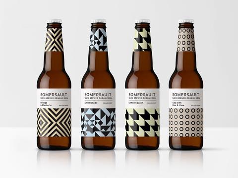
New Instagram-worthy drinks brand Somersault launches in a bid to tap into the burgeoning adult soft-drinks market, with a stand-out identity by drinks design specialist Denomination.
The adult soft-drinks category is a huge growth area globally, as more consumers seek out no- and low-alcohol options with grown-up flavour profiles. Slow-brew soda start-up Somersault spotted a need for a healthy option to appeal to style-conscious people who want to drink less alcohol yet don’t want to increase their sugar consumption.
Denomination was asked by Somersault to create a brand and packaging design that would be aesthetically distinctive, aspirational and memorable, and that café and bar owners would be happy to display ‘like art on a shelf’.
The design team at Denomination came up with a strong graphic approach that creates great stand-out on shelf, is worthy of above-counter display in cafés and bars and provides clear varietal differentiation. The identity also stays well away from clichéd ‘natural’ and ‘organic’ design cues, looking instead to the premium-craft-drinks market to appeal to a discerning target consumer who appreciates hip, healthy options.
Contemporary pastel colours were selected to reflect the brand’s organic ingredients and good-for-you credentials. The designs are also echoed on the bottle necks to further boost stand-out and allow for a more minimalist approach on the main labels.
With so many ‘healthy’ sodas on the market in fact packing a super-sweet punch, it was also felt important to hero the key ‘low sugar’, ‘organic’ and ‘slow-brewed’ brand assets on the wrap-around label, with supporting content and tasting notes.
Finally, a strong bespoke logotype, uncoated paper stock and embellishments were used to reinforce the premium positioning of the brand.
Rowena Curlewis, Denomination CEO, says: “One of our key challenges was to create an identity that would overcome consumer scepticism that ‘healthy’ fizzy drinks lack flavour or contain artificial sweeteners. To do this we created a distinctive packaging design that sets Somersault apart from other brands, reassuring customers that they are drinking a high-quality product that tastes good and looks gorgeous.”
Neil Barker, Somersault Director, says: “Denomination exceeded the brief to create pieces of art that the coolest of cafés and bars are happy to display next to premium drinks and gourmet coffee brands. The designs provide a contemporary expression of craft soda, and the patterns provide a generous canvas that is highly disruptive, engaging and refreshing, while being understated, confident and stylish.
“Just a few weeks after launch, and with no PR or advertising support, the design has been pivotal in generating interest and excitement with the drinks trade. Retail uptake has exceeded all our expectations and we have secured listings in more than 100 of the trendiest cafés and bars in the country. Some mixologists are even using the sodas as mixers – a brand extension that we had not envisaged.”


