A dash of strategy, a twist of inspiration and a pinch of heritage transforms Saxa into a brand that’s more than worth its salt.
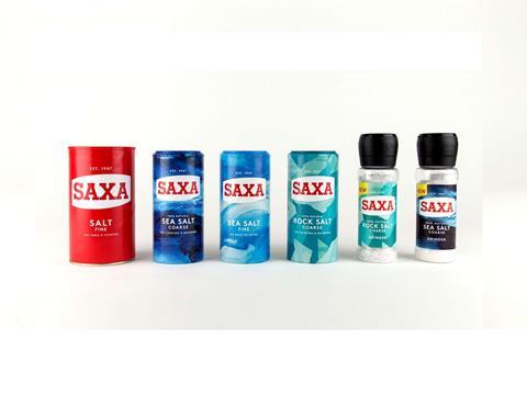
To many UK households, Saxa is salt. Saxa has been around since 1907 and is one of the UK’s better known heritage brands. Premier Foods asked Robot Food to reinvigorate this trusted brand with a stronger, fresher purpose, contemporary appeal and to give it pride of place again in UK kitchens. The rebrand would include fine table salt, cooking salt and Saxa So-Low, as well as rock salt, sea salt and new, more premium products.
Salt may be a commodity but it’s a quickly evolving category. Premiumisation, flavour innovation and new brands in the marketplace were all compromising Saxa’s status as category leader (IRI Major Multiples, data ending 52 w/e 28 Jan, 17, Salt Category), reducing relevance among modern consumers. Putting Saxa under the microscope, Robot Food held a workshop to pinpoint the brand’s unique role in the salt category and reassert its leadership position.
The team uncovered a wealth of relevant themes and ideas, including how Saxa empowers ‘intuitive home cooks’ with choice and inspiration to make flavour come alive in every home. Armed with a clear design strategy, Robot Food took a thoroughly modern, upbeat and focused approach, leveraging Saxa’s rich heritage by simplifying key brand assets and amplifying the most relevant equities.
The result is bold and expressive. Strikingly simple abstract cues represent the type of salt and communicate the flair Saxa brings to cooking. Taking inspiration from the sea, the sea salt products’ dashes and swirls evoke freedom of culinary expression and the invigorating experience of ocean waves. The coarse rock salt product is differentiated with a blocky design that evokes the texture of the natural rocks from which the salt is mined. As the original pack format was a key asset, the team stayed loyal, choosing to use the iconic drum shape to strengthen Saxa’s well-established brand recognition.
The previous serif logo font was refined and the holding device was simplified. A contemporary sans serif was introduced for the variant name and descriptor, while ‘Est. 1907’ reinforces the heritage. Matte packaging gives a tactile, premium feel, and the result is a great-looking, clearly united, complementary salt range for the intuitive or creative home cook.
Inspiring, contemporary and still very much rooted in its proud heritage, the rebrand confirms Saxa’s iconic status and is clearly relevant to all consumers in an expanding, innovative category – but the innovation doesn’t end there. Saxa is now preparing to launch their own range of salt and pepper grinders. These will be the first grinder products that Saxa have launched, with more exciting products soon to follow.
Radka Sovsakova at Premier Foods, said, “We are delighted with the outcome. The rebrand demonstrates flair and credibility, and Saxa can continue to be a proud bearer of salt. This is a fantastic base on which to expand.”
Dave Timothy, Client Director at Robot Food, said, “Saxa is one of those brands we all grew up with and they’ve always done one thing very well. We love helping brands with self-esteem and Saxa can stand tall and proud in what’s now a hugely progressive category. We can’t wait to see the range hit supermarket shelves.”
More info:


