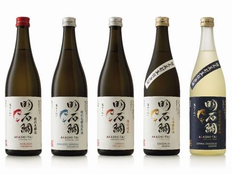
Akashi-Tai, a range of five artisan sakes, launches its new identity and packaging design. The design conveys the genuine artisan nature of Akashi-Tai, which is brewed in small batches using traditional methods, and positions the brand as an authentic premium player on the global stage.
Cowan London won Best Packaging Design for Akashi-Tai at the International Beverage Awards held at Japan’s largest industry trade show Drink Japan on June 27th.
The challenge was to design for two diverse markets with different cultures, codes and customers, ensuring the brand remained credible in Japan, whilst engaging new audiences in emerging Western markets. The current design looked neither premium, nor artisan, but was ‘the one with the fish’.
Cowan initially worked with the brand team at Akashi Sake Brewery to help them define the proposition, brand essence and brand story, to prepare for launch in the US and Germany. The rebrand is rolling out across the UK now. Akashi Tai launched in the US as a new brand at the start of 2018 where results have been extremely promising, with plans for it to roll out in France, Germany and other countries in Europe imminently.
Cowan immersed themselves in Japanese culture, to fully understand sake, the significance and importance of Japanese symbolism and iconography, and to gain an understanding of Japanese design codes and nuances, all of which proved to be very different to what we are used to in the West.
A true privilege
Elizabeth Finn, Managing Director, Cowan London, says: “Creating sake packaging was a true privilege. It’s very rare for a design agency outside Japan to be given that honour, but with our team’s extensive experience in alcohol branding, and our four offices in Asia, we were ideally placed to help Akashi-Tai realise its vision of bringing sake to the wider world. It was wonderful to see our work gain this recognition at the International Beverage Awards.”
Fortune favours the brave
A sea bream, or tai, a symbol full of meaning in Japanese culture, has always been Akashi-Tai’s brand symbol, as it embodies the attributes the brewery aspires to: strength, resilience and curiosity. Creating a new execution of the sea bream, one that would be distinctive to Akashi-Tai and reflect the brand story, was fundamental to the new design.
Samantha Dumont, Creative Director, Cowan London, says: “We needed to ensure that Akashi-Tai remained highly credible in Japan, whilst appealing, in a less expected way, to an increasing number of intrigued Western consumers. It seemed natural that the Tai icon and kanji calligraphy should take centre stage on the label, but once we understood the nuances of Japanese symbolism and the construct of Japanese design, it was interesting to discover that we had to un-learn some of the usual graphic design rules that we apply in the UK”.
To create the tai, Cowan London worked with French artist and illustrator Aurore de la Morinerie, who had studied calligraphic technique which influenced her artistic style. She was chosen for her rapid and precise execution, which fully conveyed the character and energy of the tai.
Dumont adds: “We are delighted with this iconic representation. It is fluid and elegant with a style that really expresses the curiosity and tenacity of the fish and the progressive nature of the Akashi-Tai brand.”
Hirano Sogen, a renowned and respected Japanese artist and calligrapher, was commissioned to create the Akashi-Tai kanji brand mark. This powerful yet fluid mark exudes confidence and works beautifully with the tai illustration.
The brand team at Akashi-Tai states: “The new design perfectly balances Japanese purity with an iconic and visually powerful aesthetic that will appeal to the Western eye, whilst at the same time retaining unquestioned traditional credibility in the domestic market. The brand is now in a perfect position for growth.” “This was an incredibly challenging project. Tackling a seemingly impossible challenge, it required a solid and tight working relationship and real commitment from our agency. Cowan was brave enough to take on the challenge and was with us every step of the journey.”
The five variants now all display a unified and iconic design. A limited palette on beautiful Japanese paper reflects the artisan nature and the authenticity of the brand. A neck label and frosted glass bring to life the more premium sakes, and colour coding across variants helps customers understand and explore the different sake choices across the range.


