


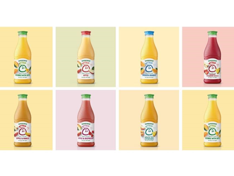
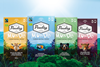
New packaging has been designed for Innocent Drinks’ entire juice and smoothie portfolio, intended to reflect the products’ natural, refreshing ingredients and help consumers easily navigate the drink lineup.
Applying to Innocent’s core and super smoothies, juices, and Innocent Plus (iplus) blends, the new design strategy emphasizes simplicity. Hand-drawn details and natural photography are implemented to highlight that the drinks are made by humans.
For instance, the brand’s signature ‘Dude’ logo has been redrawn with custom woodmark. Labels applied to the juice range will also contrast photographed fruits against a white label to convey the drinks’ refreshing taste.
Meanwhile, the core smoothie labels will feature a subtle tint to distinguish them as thicker and nourishing. Similarly subtle gradients and tints will apply to the super smoothie range, aiming to depict the functionality and value of the product, but these labels will also feature richer colours.
The iplus range, on the other hand, will have transparent labels. This is set to showcase the colours of the drinks themselves, with simple range descriptors helping consumers to navigate the range.
The brand’s logo has also been straightened and integrated into other design elements, featuring prominently on the front of every pack. ‘Playful’ copy will be printed on the back of every pack, with its tone of voice said to be ‘unique’ to Innocent.
The new packaging will roll out across the brand’s 18 markets from October 2024 and is expected to be complete by February 2025.
“Our designs have evolved organically as we have grown, but as we looked ahead at our future, we found it was time for a refresh,” said Irem Mainwaring, head of Brand and Portfolio at Innocent Drinks. “Realizing our packaging wasn’t making it easy for our drinkers to choose our bottles and enjoy the goodness of fruit and veg inside was what inspired our new design strategy – making our ‘Dude’ the star of the show again no matter where in the world our drinks are being sold.
“Our dude is a beacon of goodness, with our drinks being an easy and delicious way to get more fibre, vitamins, minerals and phytonutrients into our diets, so we wanted a visual language that matched this. The result is a bold and playful system that aligns with the innocent brand whilst helping drinkers understand the goodness that goes into our juices and smoothies. We can’t wait for this to hit shelves in the following months.”
In a similar development, STORMBRANDS helped Tropicana introduce a ‘fun, reassuring and distinctive’ rebrand for its Kids Smoothies range late last year. Photographs of real fruits and the ‘iconic’ straw were displayed alongside declarations of ‘no added sugar’, ‘boosted with vitamin C’, and ‘1 of 5 a day’ to encourage parents that the drinks contain natural ingredients.
This summer, B&B studio and Wilkinson Sword also joined forces to rebrand and restructure the latter’s shaving and grooming portfolio. Hoping to differentiate the products from others of their kind on the market, the rebrand establishes black as a core brand colour, and differentiates each range via colour blocking, layout and typography.
If you liked this story, you might also enjoy:
The ultimate guide to the Packaging and Packaging Waste Regulation in 2024
How are the top brands progressing on packaging sustainability?
Sustainable Innovation Report 2024: Current trends and future priorities
Everything you need to know about global plastic sustainability regulation


No comments yet