


The brand design and innovation agency Echo has worked with Rexona, which is owned by Unilever, on a packaging redesign for its anti-perspirant and deodorant ranges with a focus on communicating efficacy and maintaining brand identity across the UK and US markets.
Echo has previously worked with Rexona in 2006 and 2013. For the recent redesign, Echo developed the brand’s core portfolio, which includes the Performance, Sensorial, and Added Benefit ranges. The brands are known as ‘Sure’ in the UK and ‘Degree’ in the US.
According to Echo, the goal of the most recent partnership is to help to re-assert Rexona’s performance credentials with a “refreshed” packaging design, with the new look being part of the brand’s overall strategy to empower customers to live active lives.
Denise White, account director at Echo, explains: “Rexona is one of the most recognisable deodorant brands worldwide, but the brand needed refreshing to unlock a sense of superior efficacy, maximise impact and stand out from the competition.
“We worked on the idea of ‘No Limits’ as a creative platform which helped us to devise ideas about empowering users to feel confident when active in all capacities - whether that’s running a marathon or for the bus.
“This emphasises the brand’s ‘it won’t let you down’ strapline to hero Rexona’s performance credentials and therefore its core point of differentiation.”
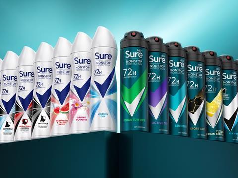
Echo says that archetypes were used to help understand how the brand’s expression of efficacy should be communicated. The brand’s previous packaging design was apparently simplified by Echo, which also reworked the communication hierarchy to emphasise the brand’s efficacy.
In addition, with the Rexona Tick reportedly being one of the brand’s most “distinctive assets”, Echo positioned it at the centre of the “dynamic, confident, [and] bold” new design. The company says that this “delivers a strong unifying presence” for Rexona brands across markets.
Echo adds that it delivered local market adaptation via colour and variant graphics. To maintain the brand’s recognisability, the colour teal was retained for Degree in the US while the women’s range in the UK has kept the white palette.
The Performance Range features “striking, contrasting colour rays” to communicate its efficacy, according to Echo, while the Sensorial Range design includes “dynamic, explosive ingredients and bursts of light” to communicate invigoration and freshness. The Added Benefit variants followed a similar design system, but apparently lead with the core benefit claim and supporting icon to ensure clarity of communication.
Nigel Ritchie, creative director at Echo, comments: “Redesigning a global brand on this scale is hugely challenging. We had to ensure the brand was not only strategically re-purposed but underpinned by a set of overarching design principles deeply rooted in the brand’s DNA.
“With a strong set of principles established, a firm understanding of existing and relevant brand equity and an inspiring brand idea we were able to deliver a powerful global look that flexes appropriately across different markets, product formats and price tiers.”
Last year, Rexona developed a deodorant pack, ‘Rexona Inclusive,’ specifically designed for disabled consumers. The hooked design and magnetic closures of the container reportedly allow for one-handed use.


No comments yet