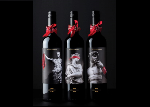
Drinks design specialist Denomination has unveiled packaging and brand identity for Fazzoletto, a new wine from Piedmont-based wine co-operative Araldica.
The challenger brand from Northern Italy has a unique contemporary wine style and is made using revolutionary winemaking techniques, which needed to be reflected in the design.
Denomination developed a compelling brand story around the ‘fazzoletto’, which in Italian means ‘neckerchief’ and was the term used to describe Italian partisan fighters who wore red fazzolettos in combat as identifiers at the end of World War II.
The name captures the contemporary and rebellious feel of the new brand that flies in the face of the traditional wine category and yet is an authentic nod to Italian heritage.
The brand identity of Fazzoletto is brought to life by bottles that feature black and white images of famous Italian sculptures which have been “vandalised” by an unseen hand who has tied a red neckerchief in a humourous way on the sculpture. Denomination further elevated the famous red neckerchief by tying a mini fazzoletto around the neck of each bottle.
The pop of the red neckerchief against the moody black and white images helps the bottle stand out on shelf and appeal as an intriguing and interesting new Italian brand.
The black and white imagery, as well the prestigious Araldica badge on the front of the bottle, adds Italian authenticity and sophistication, completing the strong and appealing shelf presence.
Anna Brolin, Managing Director, Denomination, says: ““The challenger brand from Northern Italy has a unique contemporary wine style and is made using revolutionary winemaking techniques, which needed to be reflected in the design to appeal to a younger generation of wine drinkers.
“We feel the design of Fazzoletto completely encapsulates its wine style, which is the product of a revolutionary approach to Italian winemaking.
“When the wine is as subversive as it is, it definitely called for a brave approach. The finished product looks amazing on shelf because it is so different but also incredibly premium.”
John Leech, Commercial Director, Araldica, says: “The packaging design created by Denomination reflects the mischievous spirit of our product and will help it to shake up the category too. It stays true to the brand and the design is so different from everything else going on in the sector, that it will really grab consumers’ attention.”
More info:


