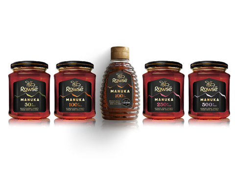
Coveris has helped Rowse Honey update its premium Manuka Honey range with uncoated substrates, brightly-coloured hot foils, and radio frequency security – all in pursuit of a modern visual identity and premium shelf presence.
The redesign was led by The Space Creative and brought to print by Aire Global and Coveris. Together, the companies conducted lab trials for decoration techniques such as double hot foil stamping, premium tactile finishes, and metallic detailing over a nine-month period.
Although the core primary packaging of Rowse Honey’s jars and squeezy formats remains unchanged, the upgraded label solution replaces silver paper with textured, uncoated substrates for a more natural look and feel.
Dual hot foil applications per label are also intended to define print definition and colour fidelity, all while achieving tactility and visual depth. Specific foil colours differentiate each SKU, including the 500+ MGO variant, and help consumers identify each product type.
Coveris’ SourceTag radio frequency technology has also been applied to the back labels – a move hoped to improve in-store security integration.
Altogether, these new features are set to stand out on the shelf and support a premium position for Rowse within the honey category. Rowse also hopes to convey authenticity and increase consumer engagement.
The new packaging will be on display at the Packaging Innovations trade show at the NEC, Birmingham from 11th – 12th Febuary 2026 (Stand J114).
Over the last twelve months, Rowse Honey claims to have recycled 42kg of its release liner waste at Coveris’ ReCover Paper recycling facility. As part of the RafCycle programme with UPM Adhesive Materials, this development is estimated to have prevented 9 tonnes of CO2 emissions compared to landfill disposal.
Coveris previously supplied its pre-made bottom block bags, made from fully recyclable paper, to package Pladis Global’s confectionery products. The high stiffness and dimensional stability of the packs are expected to bolster on-shelf presentation and avoid cracking and fibre break in side gusset areas.
In other design news, strategy and branding agency Derek&Eric has helped Gü undertake a global redesign for its dessert packaging. The revisions are hoped to simplify on-pack communication, strengthen Gü’s shelf presence, and bring the brand back to its original DNA.
If you liked this story, you might also enjoy:
The ‘complex reality’ of reusable packaging in Europe
Single-use packaging versus reusable packaging: Which is more sustainable?
The ultimate guide to global packaging sustainability regulation


No comments yet