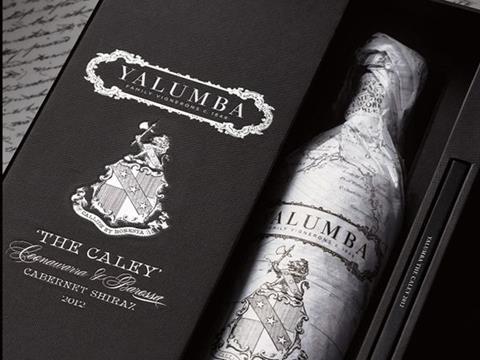
Leading drinks design specialist Denomination has unveiled packaging and brand identity for The Caley, a prestigious wine from Yalumba, a fifth-generation family wine company of the Barossa, South Australia.
The design reflects the exclusivity and luxury nature of The Caley through the use of techniques such as foiling, heavy debossing the family crest.
Horticulturalist, correspondent and adventurer
The Caley is named after Chairman Robert Hill Smith’s great uncle Fred Caley Smith, who criss-crossed the globe for 18 months to gather knowledge to help his family’s fruit growing business. The bottle highlights Fred’s reputation as a horticulturalist, correspondent and adventurer, recalling the company’s long history.
Denomination created a suite of elements for The Caley, all designed with luxury cues befitting a wine of this status. These include a gift box, photo book of Fred’s travels, invitations, brochure, trade presenter and beauty photography.
The tissue paper wrapped around the wine details the destinations and journeys of Fred’s travels between 1893 and 1894. Featuring the Caley family crest, the packaging uses sculptural embossing and overprinting.
Rowena Curlewis, CEO Denomination, says: “For Yalumba, The Caley is a wine that has been waiting to be made for well over a century. For us The Caley was a design project well worth waiting for. We love the way the company’s heritage and the story around Fred plays out on both pack and the rest of the collateral.
“The attention to detail we put into the packaging design illustrates the quality of this wine to great effect and boasts a compelling backstory to spark interest with consumers.”
Renowned wine writer James Halliday adds: “Its [The Caley’s] packaging outdoes any red wine in the Australian market today.”
The Caley launched on May 12th – the 124th anniversary of Fred Caley Smith’s arrival in San Francisco.
More info:


