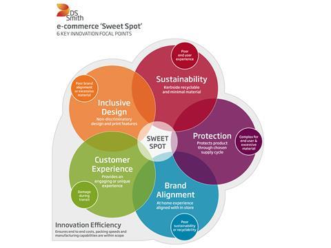
E-commerce presents more complexities in life cycle and an increased number of touchpoints compared with bricks and mortar. But, as Gavin Mounce, e-commerce Design Manager at DS Smith Packaging argues, with the right tools, knowledge, expertise, and innovation methods, your packaging ‘Sweet Spot’ can be found.
Corrugated cardboard and the first box designs were created over 100 years ago for the bricks and mortar supply cycle, long before the internet was created. Not only does this mean that there is a great amount of history to learn from, but there have also been many developments throughout this time period. All of this has led to the creation of fantastic innovations, whilst also providing a clear method for measuring and testing the performance of these designs. And, while e-commerce packaging is essentially still in its adolescence when compared with these longer-established physical channels, it is considerably more complex – with a greater number of touchpoints and a rapid pace of evolution. We have arrived at a point where end-users expect to be able to purchase when, where and how they want, which has created many different channels and methods of delivery, as well as a battle for domination of the future final mile.
In the early days, e-commerce packaging designs could have been described as adapted bricks and mortar solutions, whereas nowadays there is much more focus on e-commerce-specific designs and materials. Although designs have started to change in line with customer demand, the end-users’ expectations have grown just as quickly, if not faster. Originally, providing protection and delivering on time resulted in a satisfied customer. Then came the introduction of inside print, followed by the unboxing experience; now we’re seeing the latest focus points of connectivity, sustainability, and inclusive designs. So, with all these changes and rapid growth, how can we create packaging solutions that really work for e-commerce?
Unlike bricks and mortar, everything for e-commerce needs to be invented or reinvented, as we don’t have guidelines or learnings to follow. Designing for e-commerce used to be a blind process – sending parcels off with a courier to test their capabilities, not knowing if customers would receive them and be able to provide the critical feedback required. Key issues with these methods included not understanding at which touchpoints problems occurred, and theorising as to why the same parcels had completely different levels of damage. Without knowing what caused this, you could be solving issues that were not there in the first place and missing something vital. In response to this, DS Smith developed a full suite of e-commerce tools, support material, and workshop methodology, along with investing in two DISCS™ testing laboratories, so that we can provide end-to-end solutions covering all these existing and evolving customer demands.
This understanding starts to highlight how difficult it is to create a solution for the e-commerce supply cycle and even more so for the “Omni-Channel”, which sets both channels’ negatives and positives in opposition to each other. All good designs have limitations, whether material, size or manufacturing tolerances. However, by putting all these focus points in one place we can clearly see the problems caused by concentrating on one area in too much detail.
Taking your customers’ needs and understanding what drives them, you can start to use the below Sweet Spot template to observe how it will affect other areas of your packaging solution.

It is vital to understand that this packaging solution could be the customer’s first point of contact with your brand, meaning e-commerce packaging needs to harmonise with your in-store experience or brand strategy more than ever. Put yourself in the place of your customer – imagine purchasing a luxury brand of handbag in-store, how the staff made you feel, the way the product was wrapped, presented and, above all, how you felt about the experience. Now, imagine purchasing the same product online. This time it arrives at your home in a crushed and dented white shipper box, dirty from the journey with black scuff marks. Then you open the box to reveal your handbag sliding around inside – 50% of the pack is empty with no void fill, you feel like your order was not important and was processed in a hurry. Would you buy from this brand again, all because the packaging was not suitable? Think about the different experiences and how people sometimes assume that buying online is the more price-competitive option; however, packaging requirements and courier costs can soon add up. How do you add value and create a great shopping experience without adding significant costs at the same time?
Hitting the ‘Sweet Spot’ when creating a new e-commerce pack design is based on the balancing of six critical focal points. The importance of each focal point will be led by your customer’s/end-user needs, expectations, and aligned with your brand strategy. If your brand is focused on sustainability, then this could be the main area of focus – a performance solution developed using minimal fibre, for example. Or, your product could be heavy and require further protection, meaning that a customer unboxing experience is not so critical, so your ‘Sweet Spot’ would have different focal points and target areas. This method allows you to hit the ‘Sweet Spot’ for your brand and customers, focusing your attention on what is important to them when developing new packaging innovations for either a specific product or even your whole packaging suite. Each brand (and even different products within the same brand) have unique requirements and needs, but it is also vital to understand the issues that can be created when focusing heavily on a single area and the negative impact this can have on another focal point. Hence the need for balance and compromise in some areas, which does not necessarily allow for the development of a ‘Perfect Pack’, but a great design that excels in each of the chosen innovation focal points.


