


Several consumer goods companies – including high-profile Unilever and Procter & Gamble brands – have unveiled what they refer to as inclusive or accessible packaging designs in the last few years. These companies often assert that they worked with disabled people during the development of the packaging, and that they are the first to launch a product of this kind.
While largely aimed at European, UK, and US markets, Sirui Ma explains that many of these packaging designs have already existed for over 30 years in East Asia. Kao Corporation, for example, introduced tactile markings to its shampoo ranges in Japan in 1991 as Sirui Ma details in her exploration of Anglocentrism in business. In western markets, few packaging designs hailed as inclusive appear to have made it beyond the prototype stage.
Packaging Europe has covered some of these releases, including, most recently, an interview with P&G about its new Ariel laundry capsule box, which the company says was “designed with inclusivity in mind”. In a Twitter thread critiquing the article, Liz Jackson, Founding Member of The Disabled List, highlighted how power dynamics that manifest in packaging research and development processes frequently exclude, infantilise, and harm the disabled people who companies claim to have consulted or designed for.
In this interview with Jackson, we discuss what it means to invoke inclusive packaging design as a concept that reinforces the exclusion of disabled people from design processes and undermines disabled people’s ways of hacking existing packaging, while appealing to able-bodied audiences’ desire to feel good. Jackson expands on the systems of power that harm and extract from disabled people when they are bought into brands’ design processes, as well as when disabled people are placed in opposition to sustainability. Looking towards critical design practices, we ask, how can packaging design honour and centre disabled people?
To begin with, how do you define disability, and what does it mean to engage in disability as a critical practice in relation to design?
In terms of disability, there are two working approaches, neither of which I identify with. The first is the medical model, which states that a person is disabled by their body. The other mode is the social model, which states that a person is disabled by the world around them.
My partner at The Disabled List, Alex Haagaard, is working on a new model of disability, which they describe as a state of negation. In this model, disability is the way you’re negated by society, such as by being told you need to be cured or being expected to overcome your will by “just powering through”.
Our organisation, The Disabled List, is now more focused on disability as a critical design practice rather than as a creative practice – because we’ve realised, to a certain extent, you can’t creative your way through things that require systematic change. What I like to say is that I honour the friction of disability. When brands try to engage with disability, their intent is often to smooth out friction, but that friction can oftentimes be really helpful.
Is there a common definition of inclusive design?
Inclusive design was popularised by Microsoft through its Inclusive Design Toolkit. There is a core principle to inclusive design, which is this notion that you solve for one and you expand to many. This premise is partially accurate – there are things throughout history that disabled people have designed that have gone on to change the world. For example, the bicycle was invented in 1655 by a paraplegic.
The issue happens when, in designing for one and expanding to many, disabled people are written out of the brand story entirely. The branding of a product developed through inclusive design may erase the disabled person it was supposedly designed for by not using the word disabled. The product may ultimately be made inaccessible to disabled people because it’s too expensive or doesn’t get a commercial launch. I don’t think brands realise how much this drives away their disabled consumers, but the disabled customer is never actually the target audience. The goal of the brand is to use the disabled customer to inspire much larger audiences.
There is no such thing as truly inclusive design. To imply that something can be truly inclusive breeds a compliance mindset that assumes there are certain ways that things need to be done, but those ways were never determined by disabled people. We end up in this cycle where a brand will rely on the previous depiction of us to inform their process. That leads to things being replicated time and again, and each one being positioned as innovation, but it is just a variation of the same thing.
With that in mind, do you think it would be beneficial to disabled people to have a standardised definition of inclusive design?
No. Methodologies, for the most part, are used by people with power to extract information. I have yet to really encounter a methodology that allows disabled people to benefit from their own designs; that doesn’t exist yet.
There is, across the board, a lack of rigour that stems from the way in which people have been taught or trained to feel good when you hear a term such as accessibility or inclusion. If you feel good about something, you don’t question it. When I encounter designs that other people are interpreting with good feelings, that is the moment I know I need to start asking some questions.
A growing number of brands are announcing what they claim are inclusive packaging designs for the North American, UK, and European markets – but as Sirui Ma explains, inclusive design is not a new concept. Why do you think brands are making these attempts now?
It comes down to virtue signalling. For example, I can turn to Degree’s “world’s first adaptive deodorant created with a diverse disability community”, and to Olay’s easy-open lid. These examples show how packaging only really focuses on two segments in terms of disability: mobility and blindness.
When you look at the mobility segment, brands tend to create larger solutions that would be easier to use for people that lack dexterity. The Degree deodorant has this hooked, curved lid, so that anybody who picks it up for the first time is going to know what it is. But Degree also segmented for blindness by using braille. This presumes that anyone who’s blind can read braille, which is very much not the case. It also underestimates the blind user. What it says to me is that a company like Degree isn’t using braille to communicate to disabled customers, it just realised that the curved lid isn’t enough to visually signify inclusion, and so it needed to add another layer.
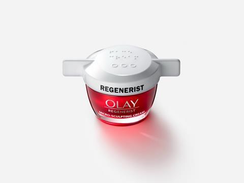
You can apply that to the Olay easy open lid, which again had a very unique bottle cap. On the top of the bottle cap, I believe the word in braille was “face cream”. But you couldn’t actually purchase a face cream container with the cap on it. You had to order it online separately. The cap worked on four different types of face cream container, but if a blind person has two different forms of face cream, they only have one lid. Whatever braille was on top of the lid, it’s not useful for them in their day-to-day life. Again, this shows how braille is used as a visual signifier of inclusion.
I am still not aware of an inclusively designed object that has succeeded beyond a hype. It seems to me that in corporate and inclusive design culture, what determines the success of something is not its usefulness. It’s how much hype it got. I would say the things that get most hyped are the things that most get passed over by disabled consumers.
What are some of the common issues presented by packaging design concepts that claim to be accessible?
For the most part, brands will identify the problem before bringing disabled people into this process. If they bring the disabled person in and ask about a need they might have, there’s no acknowledgement of the hierarchical structures of power that happen in these design processes. The disabled person feels pressured to come up with a tangible problem when one may not exist, and what happens is things get solved for that aren’t actually a problem.
Companies don’t acknowledge the ways in which disabled people have been hacking their own solutions for generations. If someone has a dexterity need, maybe they just wrap a rubber band around their bottle to give it a better grip. When these brands claim to be innovating, they’re erasing the things that their disabled consumers have been doing all along. As Natalie Wright writes, “nearly all designers treat their own iterations as inaugural and disability-led innovation is written out of the historical record”. This is particularly frustrating because it presumes the disabled user needs an able-bodied saviour to come in and do something for them.
Alongside this, brands have not figured out how to segment disability. The ways in which they segment disability very much limits who could possibly contribute to design knowledge, and thus who gets bought into research.
When we look at disability segmentation, we usually see it in relation to children; either disabled people are segmented alongside children or, as with the case of P&G’s laundry capsule box, disabled people were segmented as being in conflict with children. There is no way for disabled adults to exist in all of our complexity without getting away from this idea that there’s something childlike or infantile about us.
It becomes that you can’t have a conversation about disabled adults and children without also discussing safety. There become these very regimented ways in which disabled adults can be interacted with, the types of products that disabled adults can use. Anything that could potentially come close to being innovative is impossible to even bring to market because it’s regulated to death.

Can you tell us more about the disability dongle and how it manifests in packaging design?
The disability dongle, as I define it, is a well-intended and elegant yet useless solution to a problem we never knew we always had. I would group a lot of the packaging we’ve discussed into the realm of a disability dongle.
Another key component of the disability dongle is that each time we are told it is a brand-new innovation that didn’t exist before. For me, I was trying to understand why these things get replicated time and again in the name of innovation. What Alex Haagaard taught me is that it’s not actually the object that is being reinvented, it is the disabled user. The disabled user exists as a representation of what people perceive disability to be and not actually as who they are.
For example, with the P&G laundry capsule box, they bought in 2000 users and testers to test out a cardboard box. Why do you need 2000 users to test out a cardboard box? It’s because the disabled person does not exist in their entirety. They exist only as a representation of something else, and that representation is not something that is valued.
I can’t imagine these people were paid anything resembling a professional rate. I imagine at the end of the process, they were thanked for their feedback, which is an extraordinarily triggering thing for a disabled expert to hear, because when you’re thanked for your feedback, you’re essentially told that you have lost control over how the knowledge that you provided, which is oftentimes the knowledge of lived experience, will be used.
What this means is that disabled people are extracted from and don’t ever benefit from what they bring to design. So the disability dongle speaks not only to the outcome of the process, but to a process that leads to the same outcome every time.
What changes can brands make to the packaging research and development process to better reach disabled consumers?
There are two reasons why a disabled person is going to engage in a research process. The first is that they want the money, and maybe they want to be helpful. The other reason is that the disabled person does not have access to the same opportunities as their non-disabled counterparts and they are looking for a foot in the door. My issue with research is that it presumes the former, which leads them to take advantage of the latter.
At The Disabled List, we are asking ourselves: how is it that you professionalise design research? How is it that you bring disabled people into a system that has historically excluded them, and grant them agency and power? Can you engage in a research process that is not considered complete until your disabled research subject has signed off on it? How do you ensure that, at the end of the process, the disabled person will say to themselves, “this is something I did” rather than, “this is something that happened to me”?
With segmenting disabled users, what we do is simply ask: is this accessible to you? What that does is opens up much larger segments than these very narrowly defined ones that brands repetitively work with. I would say a lot of our best work comes from reaching those people that don’t traditionally get considered.

Packaging design often has a range of requirements, including meeting sustainability targets and ensuring product and consumer safety. How can we balance these factors without placing them in opposition with accessibility or making accessibility an afterthought?
Alex Haagaard came up with this term called the Peeled Orange Phenomenon, which describes the way in which disabled packaging is considered wasteful. It derives from a Tweet where a woman posted a picture of a peeled orange in a plastic container at Whole Foods and asked, doesn’t an orange already have packaging? She didn’t consider who the packaging is for. We can go to the store and see that there’s an extra plastic container here, but it doesn’t consider the fact that, on the whole, disabled people are consuming much less in every other facet of our lives. We have less money, we travel less.
A huge source of frustration is the way in which disabled people are always positioned in opposition to sustainable targets when we consume less. It doesn’t consider the fact that it is disabled people who are first and most impacted by climate change. We are the ones who are most harmed. We are the ones who struggle to breathe. We are the ones who get sick from contaminated water.
It seems to me to be a huge conflict that we are never given the opportunity to lead in these conversations. I do think, if disabled people were able to lead, these brands would get real insight and actual innovation.
To allow for those kinds of conversations to happen, we need to fully understand how power operates in these traditionally extractive processes and find ways to create systematic change. It’s complicated, but you need to be willing to bring in people like Sirui Ma who are critical of you, who you have every desire to turn away from.
Going forward, what would you like to see more of when it comes to accessible packaging design and the wider packaging industry’s inclusion of disabled consumers?
I want to see disabled people that have given everything in pursuit of an idea be given a chance to lead, to even form the initial research question. When are we going to see the marketing campaign that honours the history behind some of these solutions, that honours disabled people’s ways of living and doing?
This isn’t ticking a box. In a field where we are so desperate to feel good, how can we find ways to question our own intentions? In any of my design processes, one of the first things I ask whoever I’m consulting with is, who are you hoping to impress with this work? If I can find someone who is actually trying to impress disabled people, instead of everybody else, I think that’s a good place to start.


No comments yet