


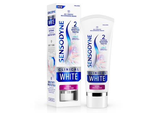
Marks has developed a design strategy for Sensodyne’s new Clinical White tooth whitening product – including vertical packaging and a premium print finish – in a bid to enhance its appeal to a wider range of consumers with sensitive teeth.
In designing the packaging, Marks sought to combine the brand’s expertise in science and aesthetics with visual indicators of beauty to achieve a premium brand experience.
The box is modelled around Sensodyne’s signature ‘S’ symbol, which has been redrawn specifically for Clinical White and divides the pack to underline the product’s key benefits – sensitivity protection and tooth whitening.
At the top of the pack, Sensodyne’s conventional blue colour is set to reinforce the brand’s commitment to gentle oral care. Below the ‘S’, a ‘spectral radiance’ print finish evokes the image of shiny, clean teeth, as well as the premium nature of the product.
It aims to express modernity, simplicity, and elegance, positioning itself as a product that consumers would willingly pay more to buy.
Matt Kerr, executive creative director at Marks, says: “We really wanted to enhance the product experience – including its visual execution and packaging design – to convey the expertise and assurance of the Sensodyne brand while also elevating the product and signalling its superior solution. The design needed to stand out on shelf but also celebrate the product in the bathroom through its premium cues, positioning it alongside adjacent categories such as beauty, perfume and other wellness products.”
Digital assets and a campaign will accompany the new product in an effort to generate excitement around its new features while assuring consumers that its message and claims are authentic.
“Clinical White marks the creation of a new tier of product that will enhance and elevate the Sensodyne brand,” says James Houghton, global senior design director at Sensodyne. “Our challenge was launching a clinically proven whitening toothpaste for sensitivity that appealed to a more aesthetically minded whitening audience willing to pay a premium for a product exuding quality.
“It was crucial that the design created a holistic and future-proof approach, building solid foundations for a premium, efficacious and disruptive experience that’s true to the Sensodyne brand.”
“We had a great holistic opportunity to define this premium range in terms of long-term vision,” concludes Kashif Amin, global experience design manager for Sensodyne. “It needed to be effective on launch but over time build memory structures with the new offering and accommodate new stories as further products are added. The design system and creative execution does so perfectly.”
Sensodyne Clinical White is currently rolling out in the UK. The USA is scheduled to follow in the coming months.
In a similar development, Colgate previously adopted an integrated brand system designed by Bluemarlin in hopes of enhancing its multiplatform educational materials and appeal to children and parents alike.
On another note, Straight Forward Design has unveiled branding and a ‘category-changing’ packaging design for plant-based Italian-style gelato brand Gigi.
If you liked this article, you might also enjoy:
The Lidl approach to packaging sustainability
How did Brazil achieve its 100% aluminium can recycling rate – and can it be replicated in the EU?
Experts have their say on the EU’s Packaging and Packaging Waste Directive revisions
A deep dive into the most important packaging sustainability trends and solutions


No comments yet