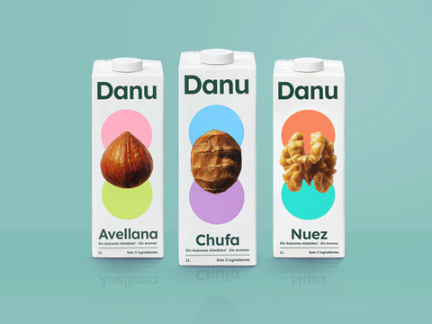
UK branding company Studio Unbound has unveiled its new design for Spanish nut milk brand Danu, aiming for a ‘less is more’ approach.
The design aims to be minimal, with a large photograph of the nut at the centre of the pack and circles of colour above and below. The studio says the logo and supporting graphics have been reduced to their simplest forms, shown against a solid white background.
The company claims that their creation is a ‘category rebel’, with the stripped-back aesthetic making a bold statement in the plant-based milk category. Studio Unbound adds that every design element has been considered to reflect Danu’s message: ‘the best things in life don’t need complications.’
“We’ve all seen those plant-based milk labels that need a magnifying glass to read the ingredient list,” says Martyn Garrod, founder of Studio Unbound. “Danu’s different, they’re not messing about. They’ve properly cranked up the nut content and stripped away anything unnecessary. Our job was simply to bring that simplicity to life through the brand.”
In related news, seafood brand Young’s launched a new design for its Chip Shop brand last year, with a redesigned logo and a new master branding and tagline. The updated look included the words ‘A Proper Taste of the Chippy’ featuring more prominently on pack and the ‘chippy fork’ being incorporated into the logo.
Beauty company AVON also refreshed its image in 2024, with a new packaging design across brands including fragrances, bodycare and skincare, aiming for a more cohesive branded house. Designed by Free The Birds agency, the two companies worked together to execute the roll out of over 1,200 redesigned product lines.
If you liked this story, you might also enjoy:
The ultimate guide to the Packaging and Packaging Waste Regulation in 2024
How are the top brands progressing on packaging sustainability?
Sustainable Innovation Report 2024: Current trends and future priorities
Everything you need to know about global plastic sustainability regulation


No comments yet