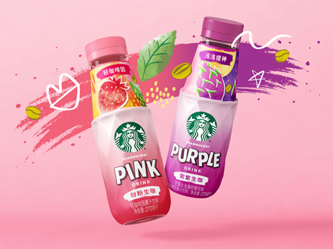
Starbucks and Marks have launched redesigned bottles for the coffee brand’s Refreshers fruit drink range, targeting China’s ready-to-drink market and Gen Z consumers with a new bottle shape and visuals.
Said to ‘exude personality’, the bottle’s shape is inspired by the ‘clean lines, tactility, precision and boldness’ of the equipment traditionally used to make coffee, including the stove-top Moka pot. Its texture is intended to resemble fruit and indicate the ‘refreshing’ nature of the drink.
While maintaining key brand equities that align with Starbucks’ ready-to-drink line, the label seeks to capture a ‘playful’ aesthetic with hand-drawn lettering for flavour names. Abstract and ‘modern’ flavour patterns have been applied to the bottle neck, while ‘stronger’ colours aim to suit local preferences and boost shelf impact.
Marks also aspires to capture ‘more expressive and evocative narratives’ via a ‘whimsical, illustrative emergent style’. By emphasizing ‘emotional resonance’ in the redesigned bottle, the company intends to ensure the ready-to-drink juice appeals to Gen Z – a demographic Marks perceives as ‘confident and authentic, with an emphasis on visual appeal and a lifestyle embracing individuality, community and experimentation.’
“Disruptive and eye-catching, the new design adds striking personality that is uniquely appealing to the younger generation of Chinese consumer,” explains Danny Lye, vice president of Design Greater Asia at Marks. “Tapping into the target audience’s pursuit of personal style and attitude, it brings elegance and a premium touch through the sensory and bold design, both in structure and graphics.
“At Marks, our greatest strength is our holistic approach, combining brand strategy, semiotics, identity design and structural expertise with the ability to build cultural resonance.
“It’s what makes the Refreshers project so impactful. Together, bottle and graphics deliver an unexpectedly refreshing visual and sensory experience.
“They mark a significant investment to position the product as a disruptor in RTD beverage, offering excitement and newness in an extremely competitive environment.”
“RTD is a crucial sector for us to reinforce our coffee leadership position in China,” adds Catrina Xiaoyu Wang, senior manager at Starbucks China. “As an exciting and disruptive extension to our line that breaks away from the more functional mindset of competitors, Refreshers is designed to drive penetration, recruiting new users and boosting our ambition to become the most loved RTD coffee brand in the market.”
The redesigned bottles have been launched via an e-commerce campaign, Morning Coffee Afternoon Refreshers.
The news comes after Starbucks announced earlier this year that it would bring back handwritten messages on its to-go coffee cups. The practice was replaced with printed labels due to COVID-19 policy reversals, but is now anticipated to help consumers build rapport with their server and give the impression of a “handcrafted beverage” – yet its critics consider it a “nostalgia play” that fails to address broader issues across Starbucks establishments.
Other redesigns coming to light this year include the revival of Coca-Cola’s Share a Coke campaign, which involves the creation of personalized Coca-Cola cans – either pre-printed or customized via an on-pack QR code. It is hoped to encourage sharing and real-world expressions of affection in line with the company’s ‘Real Magic’ brand platform.
Meanwhile, nut milk brand Danu has redesigned its packaging with the help of Studio Unbound. Described as a ‘category rebel’, the pack is intentionally minimalistic in line with Danu’s message that ‘the best things in life don’t need complications’.
If you liked this story, you might also enjoy:
Reuse vs. single use – which is better for the environment?
Sustainable Innovation Report 2025: Current trends and future priorities
What can the world learn from South Korea’s world-leading performance in plastics circularity?




No comments yet