Design Bridge have shared details of the new global visual identity and packaging designs they have created for Cornetto, the Unilever ice cream brand.
The new designs have been created to bring a consistent and up-to-date expression of the brand’s personality across all markets for the first time, while staying true to what people have always loved about Cornetto.
Claire Robertshaw, Executive Creative Director from Design Bridge commented, “The current Cornetto brand was being executed by local teams in individual markets, which resulted in inconsistencies in how the brand looked and felt around the world. It also felt outmoded with its young target audience and the way the world of food has moved on. Our challenge was to create the first global visual identity for Cornetto to express the brand’s unique personality in a coherent and distinctive way that also felt relevant and engaging to consumers.”
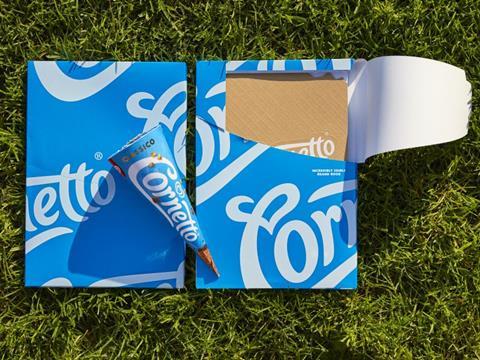
Design Bridge developed the creative idea ‘Making the Moment’ to underpin the design, inspired by the Cornetto moments that bring people together over their favourite ice cream. It’s an idea linked to Cornetto’s roots as the original makers of creamy ice cream in a crunchy waffle cone, and inspiring spontaneous, lovestruck moments. The team captured the ‘Making the moment’ idea and brand personality in an ‘Incredibly edible brand book’ that vividly embodies Cornetto's playful personality before bringing it to life through the new visual identity and packaging designs.
Mike Stride, Creative Director from Design Bridge commented, "We kept the ‘creaminess’ and fluidity of the logo but made it simpler to give it a younger, fresher feel. We stripped it of its synthetic and artificial effects so that it reflects the genuine quality and real ingredients of the ice cream. This is combined with a new, natural texture on pack that adds a further sense of realness and tactility to the design. We also created a new colour palette, which used to vary widely from market to market, using a bright, optimistic sky blue and real food colours.”
Design Bridge have brought out the playfulness and spontaneity of the brand on pack by championing the snap of the cone and the iconic chocolate tip, and by overlapping the logo and product photography. Similarly, the Cornetto Mini packaging features 8 dancing Cornettos on the front that join together to make a long line of dancing mini Cornettos when stacked side by side. This playfulness is carried through to the copywriting on pack, with fun and surprising details like "keep in the freezer (and close to your heart)” and "Best before… (anyone else gets them)”.
Duncan Robertson, Global Senior Brand Manager at Cornetto commented, “Design Bridge have selected typefaces that perfectly conjure both the creaminess and crunchiness that people love about Cornetto, and added a playful ‘ice cream splat’ seal of authenticity on the front of the packaging that assures people of Cornetto’s superior quality.”
Design Bridge has also developed a new photography direction for the brand that moves away from hyper-realised imagery towards natural, real photography instead. Barbara Cavicchia, Global Brand Director at Unilever commented, “Cornetto is such a well-loved brand all around the world and we wanted to encapsulate what people already love about it in one global visual identity while appealing to new generations of consumers. The new packaging really captures the authenticity of the brand in a simple yet distinctive way.”
Ian Maskell, Global Vice President at Unilever added, “Design Bridge have done an amazing job at helping us get right to the heart of what Cornetto means to people and have ensured that the brand will be the maker of many more lovestruck moments in the years to come."


