A recent study rooted in neuromarketing shows that designers and consumers may have different ideas about ‘good’ design – writes Ralph Olthoff, global marketing director for wine and spirits at Avery Dennison.
Few things excite marketing professionals more than a brand refresh: when best practices, consumer insights, and creativity are marshalled in the service of retaining loyal consumers, winning new ones, and better conveying a brand’s essence.
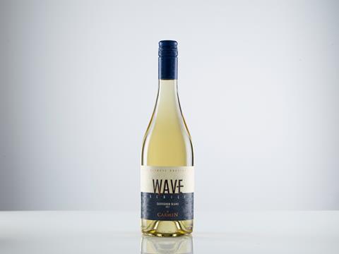
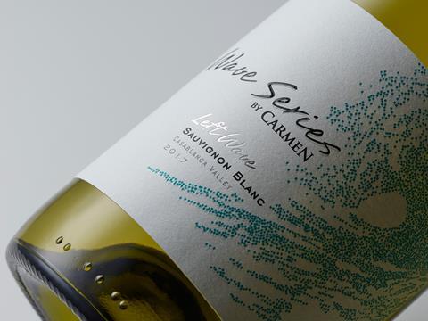
Recently, label designers at Chile’s Santa Rita Wine decided to bring an extra level of rigor to their process for updating the winery’s Wave Series by Carmen brand. Partnering with Avery Dennison and Mind Insights, a neuromarketing scientific organisation, the winery used brain science to probe consumers’ unconscious responses to a proposed new label design. What the designers learned was both counterintuitive and immensely useful in helping them better connect with people perusing the wine aisle.
Two designs, four facestocks, three countries
To get beyond surface-level focus-group responses, researchers used a cutting-edge scientific approach, thanks to their ability to apply the most advanced scientific methods including neurological, physiological, non-conscious psychological, and behavioural research methods. Their study tested consumer responses in three target markets: the US, France, and China. Each study sample consisted of 80 participants, male and female, aged 30 to 70—people who liked wine, but didn’t have professional experience in the industry. Research sessions took place in a lab set up like a wine bar, where consumers could relax and handle the bottles and labels.
The study examined participants’ automatic reactions to both the Wave Series’ original label design and the proposed new design, including four possible label facestocks. The original label featured a lighter, more elegant design with handwritten typeface and a pointillist blue ocean wave reminiscent of a Japanese etching. The new design was bolder, with strong sans serif fonts, a heavy dark blue bar beneath the new logo, and subtle, embossed whorls connoting ‘ocean’ in place of the crashing blue wave.
Researchers examined consumers’ perceptions with regards to three basic dimensions: What emotional impacts did the labels generate? To what extent did the labels convey fundamental values? And to what extent did the labels to attract consumers’ attention?
The results: five quick takeaways
The most surprising outcome of the study? Participants’ perceptions were generally more positive towards elements of the original design. The original label aroused more positive emotions. It read as more ‘premium’ and ‘authentic’, and was slightly better at capturing consumer’s attention.
The study also yielded these insights:
- Handwritten typefaces on wine labels might be more powerful in arousing positive feelings in consumers. That aligns with neuroscience-based marketing research, which has consistently shown that rounded typefaces elicit a more positive emotional response than angular patterns.
- That said, handwritten fonts may be harder for the brain to process, and this less fluent processing might have negative impacts on consumers’ attitude towards the product
- The most premium label material used triggered more feelings of authenticity, price value, and product quality, compared to standard label materials.
- What materials best say ‘premium’? Uncoated, tactile ones which also activate a stronger sense of authenticity and price value than coated, flat materials.
- Green is good. All three sample groups reacted more positively to it and associated it with being environmentally-friendly.
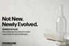
The upshot: An evolution instead of a redesign
Based on what they learned from the study, Santa Rita Estates’ designers decided to evolve the brand with a minor refresh instead of a complete overhaul, since many elements of their existing design label better triggered the desired consumer response. Designers did change the label’s facestock after noting they could better achieve their desired perception with an uncoated, tactile material rather than the glossy, non-tactile material they’d been using. And while the design team was a little surprised by the outcome, they were able to move forward with the confidence that their label design would be based on scientifically gleaned insight from actual wine drinkers.
This article draws on research conducted by Avery Dennison, Santa Rita Estates and Mind Insights neuromarketing organisation. The full report is available for download on my-muse.com, a digital platform intended to inspire innovative solutions for designers and converters.