


After the box for Nintendo’s new Switch 2 was revealed, consumers have fiercely debated whether its similarities with a previous model’s packaging, or its ‘boring’ design, could jeopardize the console’s commercial success.
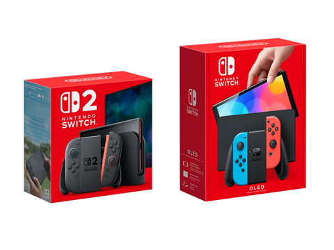
The discussion originated with an X post shared by YouTuber and streamer Wood Hawker. Attaching a screenshot of the previous Switch OLED and new Switch 2’s boxes positioned side-by-side, his caption read: “Call me crazy but this packaging is far too similar and a bit confusing for the general public.”
Several commenters disagreed, with the overriding argument pointing out the large number ‘2’ printed on the front of the Switch 2 box.
“That box needs to be blue and round to ensure the general public picks the right product,” quipped Homemade Hooplah founder Chrisy Toombs in one of many replies. “America is in dire straits.”
Clarifying his stance in a follow-up video, Hawker doubted that the design would “cause a failure of the console”, but specified that the packaging might be “just a little bit confusing to mums and dads”, rather than to experienced gamers or users of the previous model.
“Everyone’s stressing that there’s a giant ‘2’ on one [box],” he continued. “Yeah, the other one doesn’t have a ‘2’ on it, though. You know, the one in the bigger box with the brighter screen? That just also looks like the Switch 2 now.”
Several users agreed with Hawker. Commenter @SpeederLight1 said: “These two [boxes] do look a bit similar, and I think some mums and dads and grandmas and grandpas who don’t follow Nintendo at all will be confused.”
“I think a non-gaming parent would probably get confused,” agreed fellow YouTuber and streamer TrueAlex, “but if you are a gamer [it] wouldn’t be a problem. Would have been a lot more helpful if the box wasn’t the same colour.”
3D artist Jaunty Art Studio also suggested that a “NEW!” sticker might make it clearer that the console is a separate, updated product, rather than an extension of the original Switch.
Comparisons were drawn with the poor sales and subsequent discontinuation of the Wii U, a previous Nintendo console intended as a successor to the popular Wii. Then-CEO Satoru Iwata attributed this outcome to the company’s “relaxed” approach to marketing the product.
Commenters on Hawker’s posts alleged that some consumers mistook the Wii U for an optional expansion to the Wii and opted not to buy it. In their view, the similarities between the two Switch box designs could have the same effect.
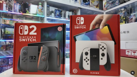
On this note, several responses indicated that the boxes could be more difficult to distinguish from one another on a shop floor than in a professional photograph.
“The giant ‘2’ is obvious here, when you have this nice photo showing these two boxes side-by-side,” said @MasterPeteDiddy, “but if anyone thinks these boxes aren’t similar enough to cause confusion in plenty of retail scenarios, then they’re totally overestimating and detached from the general public.”
“There’s marketing on the packaging for [the] Xbox and PlayStation and millennials on up constantly ask ‘which is which?’,” added user @MirrorManStanly.
Yet user @CanadianZar countered: “Make sure your parent/whoever is buying [the Switch 2] has a picture on their phone of the box. Easy way of avoiding all this nonsense.”
In defence of Nintendo’s design, various commenters posited that the Switch 2 will not be displayed on publicly accessible shelves. Rather, consumers will have to ask for it at the counter, where an employee – who will likely be familiar with the products on sale – can help identify the product they are looking for.
If there is confusion, they said, the fault lies in the consumer or retail worker’s lack of expertise – not in the packaging design, which many believed to be clear enough already.
Apple’s iPhone line was raised as a counterpoint, with slow, subtle adjustments to its minimalist box designs failing to raise the same concerns.
Beyond its differentiation from the previous model, though, the Switch 2’s packaging has also been critiqued for a perceived lack of visual appeal. For instance, X user @ChopChore described the matching box colours as “lazy branding”.
“I wish there was more excitement in the packaging,” continued graphic designer and streamer Kyle Humber. “For differentiation, but also [to] add some character and uniqueness to the console.
“We all get that it’s a successor to the Switch, no need to make everything identical though.”
@RuizManuel94 had a similar takeaway: “There should be something else different other than the 2. Not only from [a] customer confusion perspective, but for me, the box is just boring […] I’ve seen it a thousand times already.”
@HylianH3ro added: “I think the similar-looking boxes might not grab someone’s attention, especially if they’re not already focused on the Nintendo display or looking in that direction.
“The lack of distinctiveness probably won’t make them stop and say, “Oh, what’s this?” In that sense, the similar design doesn’t help it stand out.”
A previous article from McKinsey highlighted the importance of distinctive packaging for on-shelf visibility and improved consumer experience. It advises companies to link on-pack messaging and visuals to the aspects of the product consumers are most drawn to, and highlights the influential factor of the ‘unboxing’ video – as well as the value of consulting social media data to gauge the consumer response to an existing packaging design.
We also spoke to Smurfit Westrock’s Lisa Cain about the increased pressure to get packaging design right in 2025. She argued that packaging must now be simultaneously designed for usability, clarity, material impact, and brand meaning, and that ”creative thinking is still treated like a luxury in too many packaging projects.”
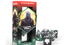
In other gaming news, PlayStation previously claimed to work with accessibility experts to package the Access controller for its PS5 console in an ‘accessible’ box. The design implemented loops to be pulled from the left or right side to slide the product out of its packaging; additional loops and a single layer of slots are present inside the pack in hopes of facilitating easy identification and access.
If you liked this story, you might also enjoy:
The ultimate guide to the Packaging and Packaging Waste Regulation in 2025
How are the top brands progressing on packaging sustainability?
Everything you need to know about global packaging sustainability regulation in 2025
The key to increasing the use of reusable packaging in supermarkets


No comments yet