During the last few months, we have all seen a host of changes in our professional and personal lives — some for good, others less positive. This unique situation has forced many of us to reappraise our approach to work and our priorities more broadly. Inspired by the opportunity to think and behave differently, Anthem Worldwide's Amsterdam and Brussels team have been exploring how packaging design can be used to help influence positive change across different categories.
This six-part series uses insight and purpose-driven concept design to challenge the status quo, elicit behavioural change and improve user experience — providing new opportunities for brands to create more meaningful and valuable connections with their consumers. Part five in Anthem's series looks at a new category of flavoured milk for adults, that uses more complex taste profiles and innovative structural packaging design to offer a grown-up and indulgent beverage.
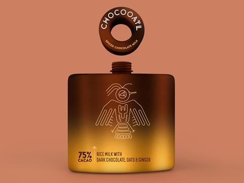
Chocooatl is a conceptual packaging design for a spiced chocolate and oat plant-based milk; a grown-up product and a mature design to fill a glaring gap in the ready-to-drink market.
The confectionery category is flooded with every conceivable mix of flavoured chocolate — including a vast array of more adult ingredients such as chocolate with chilli, ginger, and cinnamon. The demand for such taste profiles is well established, but it hasn’t yet traversed beyond traditional bar formats. Yes, we have a few health-focused, plant-based chocolate drinks, but why don’t we have the same diversity of flavours that we see in the confectionary aisle?
Historically, both chocolate and chocolate milk are a treat, a moment of indulgence and, for many, a guilty pleasure. These emotions are so well embedded in our psyches and, while some 90% cacao brands try to convince us otherwise, chocolate is first and foremost about pleasure. Chocolate milk of course, while gratifying, has more playful connotations.
Bringing these two together provides an opportunity for a grown-up, sophisticated and yet slightly mischievous innovation. It’s this mix of emotions that inspired the design of Chocooatl.
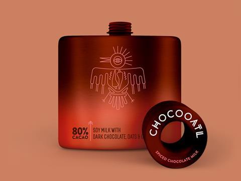
Emulating the traditional hip flask, the structure is made from aluminium, much like a tin can, but shaped to mimic the iconic contours of the traditional hip flask. Using such a format allows the brand concept to embody certain historical and culturally prevalent characteristics; the format cue clearly communicates this is a product for adults, ones who aspire to a degree of high class and also adults who perhaps, aspirationally or otherwise, have a rather puckish element to their personalities.
The cylindrical screw top is a modern twist on the hip flask's traditional captive top and serves to proudly showcase the brand name. Using this format also helps create a sense of occasion and ceremony, instantly elevating the product into something rather extraordinary.
Chocoooatl’s brand name was inspired by the etymology of the word chocolate, traced back to the Aztec word "xocoatl", which referred to a bitter drink brewed from cacao beans. Very much a "food of the gods" this beverage was often infused with similar more complex and adult ingredients.
The graphic design pays homage to this rich and mystical history with each unique illustration providing a grand and somewhat esoteric look and feel - with birds, of course, being considered sacred and divine in Aztec culture. The earthy and rich colour gradients on the pack, together with the sheen finish akin to the traditional steel hip flask, help to add to the overall premium look and feel of the range.
Chocooatl is designed to appeal to a mature, worldly, and adventurous consumer in search of true indulgence and is designed to be enjoyed as an afternoon or evening ritual.