When selecting materials for a wine label, choosing the right facestock leads to a strongly conveyed brand vision, optimum performance in its intended environment and allows for eye-catching customization options.
The three choices for facestock —paper, film and a paper-film hybrid— each lend specific aesthetic and embellishment opportunities. The right choice also ensures the label will remain intact through wet or cold conditions. As wine labels remain relatively uniform (usually paper facestock on a glass bottle) and 50 to 80 percent of purchasing decisions are made at the shelf, the decoration choices are key to making your product stand out.
Paper facestock for wine labels: Classic and customizable The traditional choice for a wine label, paper facestock evokes a classic, natural look. Brand managers can choose linen-type paper, paper with a rough, organic texture, or paper with a velvety feel — each creating a signature look and feel on the bottle. Paper also lends itself as an excellent blank slate for details. The embellishments cost more and take longer, but also further differentiate the label.
Here are some of the embellishments best-suited to paper facestock wine labels:
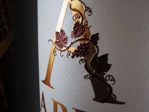
• Add shine with foil stampingHot foil stamping draws attention to labels while also giving the product a high-end look.
• Create depth and texture with an embossA variety of effects are at your disposal with an emboss on your label. This touch adds premium elegance and addresses consumers' growing preference for elegant exterior packaging.
• Highlight your logo with a spot varnishA varnish on the entire label takes away the parchment-like texture of paper facestock. Instead, add a spot varnish to a focal point, such as a logo, for an attention-grabbing gloss effect. For example, this label on Martedi Sangiovese wine features a spot varnish on the hand-drawn typography, making the name stand out among the embossed paper and creating an intriguing aesthetic.
• Switch up shapes using die cuttingCustomers find a unique shape from die cutting among the most exciting label features. It also immediately draws consumers’ attention — an essential step for converting wine shoppers to buyers.
• Protect your label with a matte topcoat application A thin matte varnish over the entire label protects it without taking away the touch and feel of the paper facestock. This addition also comes at little to no extra cost, as it covers the entire label and doesn’t require any special tooling.
Film facestocks: Higher cost, unique lookFor a sleek and modern take, consider film facestock labels. Wine labels with film facestock will stand out among a sea of estate paper labels, making film worth serious consideration for brand managers — especially those buying for the over $20 price point, where bold labels succeed. And while film labels are typically more expensive than their paper counterparts, they offer distinctive customization options.
• Go minimal with the “no label” lookAchieve the illusion of printing your label directly on the bottle by using a clear film facestock. For products with distinctive coloring, such as Viniq’s shimmery wine-liqueur fusion, the “no label” look allows the product to shine.
• Make a statement with metalized film facestocksA more striking choice, such as a metalized or pearlescent film facestock, immediately stands out among estate paper labels. Metalized films typically come in silver, but printers can add colors on top of the film to give the illusion of a copper, brass or gold label.
Hybrid facestocks: The right choice for ice bucket winesCertain wine bottles must withstand cold temperatures and wet environments. For those wines, a hybrid facestock construction —paper on top with film on the bottom— secures the label.
The hybrid facestock tends to be more expensive and won’t hold embellishments (such as embossing) as well as paper, but it is the best material for wet and cold environments.
Know the bottleA holistic understanding of your wine product plays an essential part in label material selection — specifically, the bottle. Understanding the bottle —and how it may impact the label— is just as important to your brand vision as choosing the right, well-made label.
A cheaply made bottle with a pronounced seam, for example, might compromise a label’s ability to adhere smoothly. Correctly matching colors of the bottle and facestock makes sure the design on the label looks crisp and visible. And an oversized label applied to a bottle with a uniquely shaped taper might not lay flat — regardless of the facestock you choose.
Your label converter needs to guide you through these considerations while choosing label materials and engineering your label construction. And before ramping up production, they should help allow you to perform an adhesion test with a blank label on your label applicators to ensure the finished label aligns exactly with your desired brand vision. This allows them to make adjustments to the facestock, adhesive and release tension (especially for labels with embellishments) so the wine label applies smoothly every time.


