Pete Hayes, Co-founder and Director, PB Creative design agency discusses how to give a small pack a big punch.
‘Go big or go home’ goes the expression. The premise being that to create maximum impact and make an impression, to do something to the fullest, you need to think ‘supersize’. But what that exhortation doesn’t consider is that small and perfectly formed can be substantial and head-turning too.
When it comes to brand and packaging design, of course category and product usually dictate dimension – but they don’t have to limit wow factor, innovation or ingenuity. The designer’s job is surely to create the most appropriate and effective work possible, whatever brief they’re presented with.
Little and large
Big might get you noticed in an instant, but small has its own advantages. There’s the potential to create ‘covetableness’, a kind of ‘magpie desirability’ that’s not so easy to achieve on a behemothic four-litre bottle of fabric conditioner.
Communicating brand and product messages on smaller packaging does present its own unique challenges, however, especially in the FMCG and cosmetics sectors, where consumers are faced with myriad products and want as much information as possible in a few short seconds. But there’s no reason to think of this as a drawback. If designers keep at the front of their minds that great brand and packaging design is about beauty, clarity and placing the consumer at the heart of all strategic thinking, there’ll be fewer bumps in the road.
So what are the key considerations? How do you create a strong and engaging graphic impact on smaller packs?
Hold back
It can seem a little counterintuitive at first, but it’s important not to expect a small pack to do too much. As advertising budgets shrink, the pressure’s on for packaging to deliver more and more brand and product messaging and, as a result, we’re seeing things get busier, noisier and messier.
Squeeze on too much and you risk losing focus and confusing the consumer. So pick out the key messages – and stick to your guns. Smaller canvases require control and order or you risk diluting identity and stand-out.
Understanding the priority of on-pack communication, and developing a clear messaging hierarchy that reflects it, whether that’s brand- or product-led, is fundamental.
Vaseline is one brand that always seems to get it right. Its iconic pocket-sized lip balm tins are as relevant today as they have ever been. They showcase the logo and state simply that Vaseline ‘helps heal dry lips’. Nothing else is needed. Marmite is another small pot with a larger-than-life ID. ‘Rich in B vitamins and 100% vegetarian.’ That’s it. The shapes, colours and graphics of both brands are so iconic that they say it all – nothing else needs to be presented on front of pack.
Better function
So that’s all well and good for established iconic brands, where the brandmark and pack silhouette are all that’s needed to shout from the shelves. But how can this be applied to the challenges more contemporary brands face, as they compete for attention side by side?
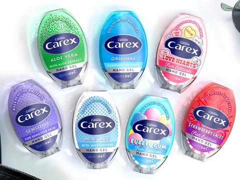
When we started work with Carex Hand Gel it was hard to spot it among the sea of similar-looking antibacterial brands (straight-sided flip-top bottles, all with similar blue colourways and me-too graphics). So we focused on creating a 3D structure based on the elliptical Carex logo; we also gave it an integrated closure so as to maintain the new seamless and ergonomic curved silhouette.
Not only did the new structure look different from anything else out there, thus achieving great stand-out, but we were able to expand the label real estate and logo by 50%, despite the fact that the pack volume remained the same.
In short, through clever structural innovation, we’ve been able to maximise the brandable canvas. And because the form became unequivocally Carex, the label’s focus could be on product efficacy. The whole approach improved functionality, range navigation, brand clarity and, most importantly, desirability.
Big up brand assets
There’s no doubt that you have to think strategically with diminutive design. When we created the 2D brand and packaging identity for Toni&Guy Hair Cosmetics there wasn’t enough room to go big on ‘how to apply’ messaging, so the graphics we used had to work hard to make it clear – sweeping mascara strokes, dabbing highlighter marks, spritzes of illuminating scent.
It was more emotive; it delivered on the product experience, whereas with Carex it made sense for the focus to be on trustworthiness and product efficacy. But with all these brands, at no point did we compromise on delivering beauty, clarity and consumer experience.
Whatever the category or pack size, there’s no reason why a brand can’t be brought to life and celebrated. Strong client and design agency relationships, paired with focused creative thinking, can help brand owners realise the full potential of their offering, and make the bijou both beautiful and impactful.
So next time you’re looking down the ‘wrong’ end of the telescope, instead of seeing a small problem, think of it as a big opportunity to create some of the most strategically and tactically effective design out there. You could have another little icon on your hands.