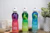
Sidel has created the NUUK bottle concept, 'drawing inspiration from the purity of ice and its formations'. The NUUK brand takes its name from Greenland’s capital and the fjords that make it famous.
Its 'Frozen, Authentic, Unique' slogan highlights the brand’s attributes, which Sidel says are closely linked to water and its features. Produced from clear, 100% recycled PET (rPET), NUUK is a container designed for high-quality, fjord-sourced premium water brands.
With a 'pure, sophisticated and distinctive' design, the 500 ml bottle has been designed to showcase the water it contains and reflects the brand’s essence. Thanks to its asymmetric shape, NUUK stands out on the shelves, putting traditional water bottle designs in the shade.
'An authentic frozen bottle arising from the ice'
“The specific ice shape on the lower part of the bottle constitutes a great asset and reinforces its structure. It gives the impression that the bottle is surging up from the ice,” explains Laurent Lepoitevin, Packaging Design Engineer at Sidel.
In line with its origins, the deep bottle base resembles a rock glacier and is produced by Sidel’s patented Base Over Stroke System (BOSS). The mechanical forming, which takes place during the blowing process, optimizes the material distribution in the final bottle base profile. According to the company, the consistent blowing process uses a minimum amount of material.
"The bottle design itself is optimized based on a specific preform design to ensure the best stretching ratio and material distribution and the best packaging weight optimization. The optimal heating process of the Sidel Ecoven technology of the Sidel blowers, with varied settings and lamp numbers according to preform neck and length, allows a precise and consistent preform heating to ensure the best blowing process for rPET resin up to 100%. The specific deep bottle base shape, blown and shaped thanks to Sidel’s patented Base Over Stroke System (BOSS) during the blowing process, optimises the material distribution in the final bottle base profile."
The wide cap, with its ice shape and blue colour, enhances the brand’s premium look and perception. The bottle is also compatible with tethered cap solutions to meet environmental requirements and forthcoming regulations. From the base to the bottle cap, the shape is taken to the next level with a transparent and cleanly designed label.
“In addition to the water quality and integrity symbolized by the fjords, the use of 100% rPET goes hand in hand with Sidel’s sustainable commitment to achieve closed loop food grade and recyclable plastic packaging,” adds Laurent.
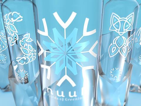
Geometric Viking art influences label design
The transparent Pressure-Sensitive Label (PSL) decoration is inspired by authentic Viking art, more specifically the Borre style. In the 10th century, the Nuuk area was inhabited by Vikings who left their cultural imprint, including their art.
Laurent explains: “The Borre style embraces a range of geometric interlacing, knot patterns and zoomorphic (single animal) motifs.”
Five versions of the label show different graphic designs based on this geometric interlacing. The brand logo is a snowflake combined with an ancient Norse symbol, Vegvisir, a symbol of protection and guidance believed to be used as a compass by Vikings. The other labels represent important symbols of Viking culture, including the drakkar ship, two head-to-tail fishes, the artic fox, and the polar bear. Consumers can collect each bottle from this unique family.