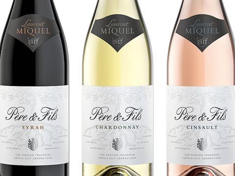
Part of Laurent Miquel wines, Père et Fils pays tribute to eight generations of the Miquel family that have worked the vines of their estate located in the high Languedoc hills. From father to son, harvest after harvest, they have deepened their knowledge of the vines and have learned to work in harmony with nature.
The Parisian packaging design agency Appartement 103 have rejuvenated this iconic French brand. The project's key objective was to perfectly balance the brand's heritage with style, elegance and modernity, staging it for future growth.
In order to achieve an evolutionary redesign status, Appartement 103 analyzed and retained the key brand equities. The main graphic design elements were preserved while making sure that every single aspect of the label was thoroughly revamped and refined to the highest standards.
The vines have been redrawn and printed with elegant blind embossed finishing, featuring the roots to empower the story of Laurent Miquel's ancestries - a well-deserved tribute. The brand name typeface has been completely redrawn and emphasized more prominently on the label for a more current look, bolder impact, while still keeping its traditional cues.Last but not least, a crest has been designed and integrated to the label as a family signature, conveying provenance and expertise.
The overall design is contemporary while conveying authenticity with a natural colour palette used across all variants.