Having encountered some impressive R&D on colour blindness and labelling by the University of Tokyo, Tim Sykes wanted to understand more about how our packaging looks to the one in twenty humans that perceives the world of colour differently from the majority. Do our brand owners, retailers and graphic designers meet the needs of colour blind consumers? Should the CPG industry be doing better? He tracked down Kathryn Albany-Ward, founder of Colour Blind Awareness, in an attempt as a corrective towards his own ignorance and our industry’s neglect of this important issue.
Tim Sykes:
Are packaged goods brands doing enough to adapt their packaging and labels to the needs of colour blind consumers?
Kathryn Albany-Ward:
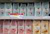
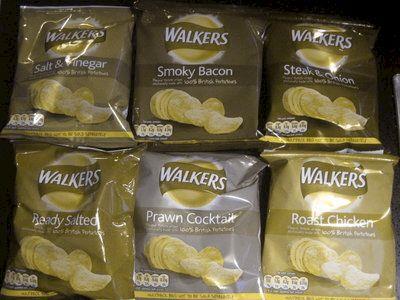
On the whole packaged goods brands don’t appear to be taking colour blindness into account, as all too often important information can be difficult for colour blind people to distinguish. People with colour blindness don’t tend to use colour when making a decision on what to purchase because so many colours can appear similar to them. They will use other ways to identify products, such as size and shape of packaging and labels. So where a brand relies mainly upon using different colours to distinguish between similar products in the same range, a colour blind person is likely to be confused and this can put them off making repeat purchases. An example of a product which we regularly receive negative feedback on is crisps. One well-known brand distinguishes between flavours using different colours (and text). The packaging of one popular flavour, Cheese and Onion, is mid-blue whilst the less popular flavour, Worcestershire Sauce, is in a purple packet. Colour blind people are forever impulse-buying without stopping to read the text, picking up Worcestershire Sauce by mistake then only realising their error once they start to eat the crisps. This happens because most colour blind people see ‘purple’ as mid-blue.
TS:
Can you describe how colour blind people can struggle with packaging and labelling that is badly designed from their point of view?
KAW:
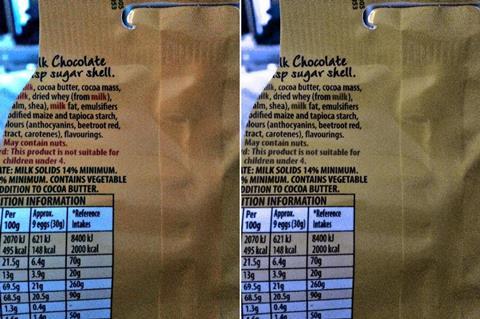
Food packaging is often badly designed from a colour blindness perspective especially where nutritional information is concerned. Often nutritional information is given in the form of a traffic light coding system but to some people with colour blindness reds and oranges will appear to be the same colour whilst to others oranges and greens appear the same. This means colour blind people need to rely on text to access the information. Unfortunately though, the text is often in black against red which means many people with colour blindness can’t read the text either. This can result not only in a lost sale but can also have health implications where a diabetic needs to know sugar content or someone with a nut allergy needs to be able to read allergy information. In pharmaceutical packaging this could have serious repercussions.
TS:
What are the most important steps brand owners and retailers can take to improve?
KAW:
The most important information companies need to be aware of is that colour blindness affects ability to perceive most colours, not just red and green. This means the solution isn’t to devise a ‘safe’ colour palette, but to ensure sufficient contrast between colours. We definitely don’t advocate reducing colour palettes, as we know how important colour is to people with normal colour vision but if you want your product to have colour blind friendly packaging it’s really important to provide other ways for colour blind people to distinguish between products easily using shapes/text/symbols. Distinguishing features such as your logo may be invisible unless there’s strong contrast between colours of the logo and the background colour of your packaging. If a competitor does a better job of this than you then you could lose up to 5% of your market to that competitor. Colour blindness mainly affects men and some clever brands who cater to a predominantly male customer base have already caught on to the fact that there are some colours which stand out to people with colour blindness and they use these colours in their packaging to gain competitive advantage. To your colour blind customers these colours can literally make products stand out from the shelf.
Companies also need to be aware that there are different types and severities of colour blindness so focus group testing is not as simple as gathering together a few colour blind people to find out whether your new packaging is suitable – you need to make sure you have people with a range of types and severities and to design products to minimum colour contrast standards.
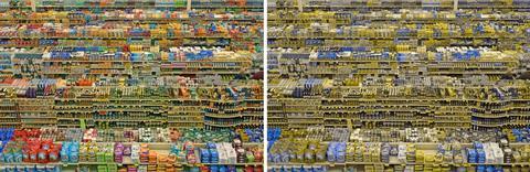
With regard to retailers, there’s no research I’m aware of into how colour blind customers shop in supermarkets but it’s likely they are more likely to stick with known brands they can easily identify due to large logo, especially those mainly blue and yellow and they are more likely to struggle to find what they want when supermarkets move products around. I must say there has been a regrettable lack of interest on their part. I’ve been in to talk to the supermarket Sainsbury's but they haven’t followed up. I also wrote to another retailer - M&S -and they replied that they weren’t interested! Why would they want to ignore almost 5% of their customer base?