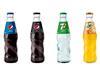


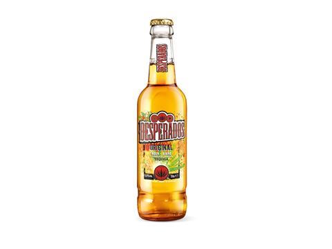
Untouched since it was first introduced 22 years ago, Desperados sees a global, brand redesign roll out in the UK this March 2019.
The new identity embodies the festivity, boldness and spontaneity of the brand, with its iconic agave symbol and bright brand colours dialled up to deliver increased visibility and stand out on shelves.
The bottle design changes will also result in an overall reduction of over 18,000 tons of CO2 (equivalent to the average annual CO2 emissions of 3,600 people globally. The reduction is part of HEINEKEN’s ‘Drop the C’ programme, which targets an 80 per cent reduction in carbon emissions by 2030.
This latest design evolution seeks to continue the brand growth, as well as enhancing visibility and range navigation, resulting in a significant increase in purchase intent to further help retailers.
“The new brand design reflects the festive personality, energy and distinctiveness, that embodies Desperados’ philosophy of “We Are The Party”, explains Izabela Glodek, Brand Director of Desperados, “As part of our wider sustainability plans, becoming more environmentally-friendly is something we strive for as a brand that always looks to rewrite the rules.”