Shushu Li, FBIF, tells Packaging Europe about the Marking Awards, a global food and beverage packaging design award initiated by FBIF (Food and Beverage Innovation Forum).
MA has been held in Shanghai since 2016. Targeting the global market, it consists of 24 resident judges, half of which are senior executives of packaging design departments from top global 100 F&B companies, such as Coca-Cola, PepsiCo, Nestlé, Mars and Wrigley, and half are founders or creative directors from world-class design agencies, such as JKR, BETC, LPK, and Mousegraphics etc.-committed to providing the most diversified interpretation and the most impartial judgment for the works entered.
During the two years of Marking Awards’ holding, it has received attention from World Packaging Organization (WPO), served as a bridge between brands and design agencies more than 30 times, contributed to traceable cooperation eight times, led to three new packages on the market, and promoted interaction between food and design.
On November 1st, 2018, the third-year of Marking Awards officially started and will continue to collect the food and beverage packaging designs from all over the world until the end of February 2019.
From the entries submitted in the first round, we are excited to see that many forecasting trends are exerting actual influences on the development of F&B packaging. Paths vary from brand to brand so that design agencies offer different solutions to different brands. However, the general direction of the game between trend and reality in the field of F&B packaging design is consistently positive, and there is a bright future worth looking forward to.
Trends becoming Reality
High Protein Water is an extremely segmented but gradually popular brand-new category.
When a new category is established or the existing segmented category is expanded, packaging tends to shoulder the special duty of creating a new world for the consumers.
As an example, the Vita Coco packaging was a hit leading to all the packaging of coconut water taking similar designs. Packaging designs of functional beverages also have such ‘general principles’.
Thick bottles, bright colours and labels with many key figures remind fitness consumers of staying healthy and extremely self-disciplined all the time.
However, recently launched Muscle Hunt High Protein Water by Nestlé in China is slightly different. It adopts neon colours with a great sense of metropolis, bringing fitness groups back to the busyness and vitality of the metropolis.
Slim bottles implicate that bodybuilding is no longer exclusive to the Chinese conventional thinking of ‘stubborn straight man’. As long as one pursues for strength and beauty, one can have a stunning physical beauty. Finally, a bright brand name with the clear demonstration of one key figure is simply displayed.
Compared to big enterprises, food start-ups are also advocates of the extreme simplicity style in packaging.
Ruofan, the inaugurator of Chinese liquid bento, is considering replacing the existing PET bottle with metal cans and has submitted the latest conceptual design to Marking Awards.
As a representative of super food with future sense, the new packaging design abandons the traditional tempting ingredients and various colours to stimulate the users’ appetites. Instead, it adopts the pure colour as the basis and the style of strongly emotionless hits the hearts of those who believe in minimalism and self-discipline. A piece of torn breach on the body of the bottle triggers consumers’ desire to have a glance and also, curiosity. Strong geometrical elements are added to the extreme simple ground colour. Different colour schemes and textures are used to illustrate different product flavors. Chocolate flavor adopts passionate red and the pattern texture of the quadrate chocolate bar; coffee flavor uses mild grey and the texture of vertical fibre; original flavor adopts real white and black. The very special brand logo of Ruofan is above the breach, which is an incomplete circle, symbolising the self-discipline brought by the sense of 80% satisfaction. This incomplete circle is quite similar to the switch button of technological products in the strong contrast of colours, symbolising that the energy and nutritious supplement brought by a bottle of Ruofan can help consumers start an efficient day. In addition, aluminium bottle itself can be 100% recycled and reused, manifesting that the brand is paying great attention to the future environment and future food concept.
The colour of packaging has great impact on consumers’ minds but used to fail to get enough attention from brand owners. Adrian Fernandez, the Vice President of the world-known colour institution Pantone once shared a set of data in FBIF2018, saying that choosing the right colour will increase the brand recognition rate by 87% and colour is able to influence buy rate by up to 65%-85%. When the colour of the year 2018 was defined by Pantone as Ultra Violet, many F&B professionals were in great doubt that it would be very hard for the colour to set off a trend in the food industry. However, since the beginning of the winter, we have to admit that purple-based drink has become a sign of new style tea. Take Heytea and NAYUKI for an example, new style tea drinks launched this winter are all, more or less, related to purple sweet potatoes and mashed taro, gaining much more popularity over highland barley, oats and pearl barley which were popular tastes in previous winters. Back to the field of packaging, international top-tier F&B brands are gradually giving colour selection more space and tolerance.
In this FIFA World Cup, Budweiser needed a Limited-Edition Bottle for China to be launched across 25 cities. The objective was to transform the global “Light Up” communications platform into an impactful design, creating a collector’s item that would excite Chinese football fans and beer drinkers alike. It was a considerable design challenge: Just how do you capture the energy of a larger than life event, and distill it into the palm of your hand?
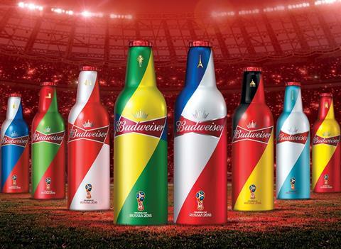
We can directly observe the key colour tones of national flags from eight participating countries, but the design team doesn’t ponderously replicate the shapes of the national flags. Instead, they decided to unleash the FIFA’s euphoric energy from the iconic “Budweiser Bowtie” as graphic light beams. While using colours boldly, it becomes a unique visual identity used in nationwide communications across 200,000 touch points. Within first week of launch, almost 200,000 bottles were sold, sending suppliers scrambling to meet demands even before FIFA officially kicked off.
Similarly, another entry of Budweiser 2018 EDM Limited edition is also very catching. The brand’s 360 Music Campaign is the key equity builder to rekindle affinity with Chinese young generation by tapping into their love of electronic dance music (EDM). The agency’s task was to design the Limited-Edition Music Bottle that would give the brand a distinct EDM style to cut through a saturated territory and strengthen the trendsetter image. Adding a layer of complexity to the challenge was the fact that the Music Campaign itself doesn’t have a specific visual asset to leverage – each year is a battle to create something truly ownable by the brand.
The designers’ strategy to create distinction was to give life to the brand’s own unique asset: the iconic "Budweiser Bowtie". They integrated it with the universal symbol of EDM – the DJ. by visually fusing the spirit of the brand with the soul of EDM along with the brand’s striking red blue and white brand colours, They created a completely ownable and true-to-brand design.
If we say that the colour system of Budweiser has already endowed itself with more possibilities, Starbucks mooncake gift box launched in 2018 for the Chinese market has provided us with another perspective. In this case, the logo of Starbucks has been maintained, but consumers will not be able to find the familiar colour match of black, white and green. The distinctive colour palette has surpassed the traditional design principle, and magically made gorgeousness and harmony coexist. While the design is filled with the sense of an international brand, it also maintains the traditional Chinese value of being wealthy and united in the Mid-autumn Festival culture. After finishing the mooncakes, the possibility of the packaging being cherished and saved for further usage is greatly increased. Let’s imagine that the box will stay at one’s home for a long time, keeping to enhancing the brand image of Starbucks to the owner.
When product iteration becomes quicker and quicker, consumers are puzzled with more and more tough choices. Unconventional packaging can help brands make breakthroughs while visualising the content on packaging is an optimal shortcut. Miel et Miels is a premium honey brand launched by French Naturalim Group. The external packaging adopts the combination of the exquisite golden card and simple black stripe pattern design. Though there are no honey-related elements like words and illustrations, characteristics of the honey products are visualised so that consumers can respond quickly and make decisions easily.
On the other hand, the reason why consumers feel tough to choose is also because they are gradually becoming picky. People care about the nutrition, health and safety facts about products more than ever, especially regarding food and beverage. Take jelly market as an example. The jelly market is embracing an overall upgrade in China to get rid of the traditional unhealthy image. As a category leader, the new product of Qinqin ‘Jelly Tea’ visualises the content on the pouch. The design combination of white clean background, transparent cup and tea, fresh fruit and a straw enables consumers to look through the external packaging and feel the internal freshness and quality of the product, resulting in a super appealing and fresh product image.
Atypical packaging refers to brand-new structures that will disrupt the market or using unconventional ways to pack the products of the existing category.
Structural design innovation depends greatly on packaging suppliers with large scale such as Tetra Pak, and ORG Technology etc. They not only develop the disruptive package structures in order to break the stereotyped shelf images, but also provide the safe and reliable filling lines to ensure the qualified product implementation. The gourd-shaped can above is very representative. It is a three-piece beverage can consisting of a resealable cover, a corrugated can body and a flat bottom cover. The can body is featured with a gourd shape, which is different from the common tinplate three-piece beverage can with single neck, double neck or triple neck. The corrugated convex and gourd shape design of the can body greatly enhance the strength and volume of the can and improve the utilisation of the material. In addition, the can body is ergonomically designed and the concave is easy to hold. Such design outcomes a novel appearance, superior texture, proper capacity, and is practical and portable. It can be filled with high-grade and concentrated drinks to meet the needs of high-quality and family-packed beverage packaging. And it has been used in batches for functional beverages and juice products already.
Another type of lantern-shaped can brings good news to the food and especially dried fruit products. It breaks through the traditional concept of reinforced ribs, and is formed by mechanical expansion. Finally the moulded product has a novel and unique appearance, it is round and lantern-shaped, and has high pot holding property. In addition to meeting the design requirements of can strength, it also pays attention to customer experience and meeting market diversification requirements.
Compared with structural design innovation, it is also interesting to see the existing products are packed in unconventional ways. The development of agricultural product packaging has provided the market with very good examples during the recent years. With the continuous development of domestic sorting technology and improvement of the cold-chain transportations, agricultural brands with fruits sorted under a standard process keep appearing in the market. ‘World Orange’ positions itself as ‘Select the best orange for you’, introducing the concept of ‘certification’ in the packaging design, meaning that only those oranges with good quality and proper size can be put into the cylindrical containers perfectly.
Product innovatively adopts the packaging form of paper cans, including two orange “enjoyment version” and five orange “taste version”. The “enjoyment version” adopts cylinders with air pressure. When being opened, there will be a light sound which shows the well sealing property with the fragrance of oranges. The “taste version” adopts paper cylinders with metal cap to display the delicacy of the products. Given many advantages such as being humidity-proof, ecofriendly, having high pressure and temperature resistance, paper cans in fact are very suitable for packing fruits. Also, the shape of oranges matches the shape of paper tube, ensuring the packaging space can be better made use of. Furthermore, the tube can be preserved as a storage box for many things like pencils, badminton balls and tennis balls, thus increasing the repeated use rate and offering a practice of green packaging.
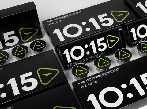
Apart from agricultural products, various Chinese tea brands have been making great efforts to conduct reform and innovation, trying hard to be reborn from the accumulations of culture with a long history and to win the heart of younger generations. Focusing on rapidly developed cold-brewed tea market, Caiyunjian Co. has taken the lead to launch 10:15 Cold-brewed Green Tea based on its advanced technology developed for 16 years. With the unique sign of clock number “10:15”, it has a very young and fashionable appearance and stands out from the traditional tea brands which often were labelled with Chinese characters. The main consumption occasion for cold-brewed tea is outdoors so that the packaging design must fully consider portability, safety and brand recognition. Most importantly, green tea has to be well preserved. Given these, sealed aluminium can is the optimal choice. Finally, the visual identity of 10:15 is neatly shown based on a combination of triangle tea bag shapes and the clock and minute hands. The overall design is very impressive which overturns old-fashioned image of tea in the young Chinese shoppers’ mind.
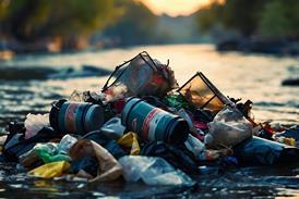
Plastic packages and takeaway garbage have aroused great concern around us. When the ‘New Plastics Economy’ is discussed in Davos, leading CPG companies like Unilever, Coca-Cola, Danone and Nestle have consecutively announced the 2025/2030 plan that they will strive for a more circular model for plastic packaging, meaning to achieve a high percentage of recyclability and reusability. Furthermore, some of the food giants are actively encouraging the government’s participation (e.g. in the UK) to together reduce the environmental influence of plastic packaging. What happens in China is that two takeaway platform giants have both started exploring a more sustainable ecosystem for their businesses, e.g. ‘Qingshan Plan’ of Meituan and ‘Relab’ of ELEME.Inc.
In the first round of entries, we are excited to see a recyclable food basket design replacing paper cartons. The creative structure allows the basket to contain more food without occupying much space, facilitates attendants to easily pick up, put oil-absorbing sheet and empty the food remains to enhance the work efficiency. The gradient hole design not only meet the requirements of structural intensity, makes the basket easy to be dried after washing, but also greatly reduces the use of raw packaging materials. There is larger space of the food baskets than that of the traditional disposable snack cartons so that consumers are able to freely take what they want and easy to share food. Improvement in the efficiency of food preparation also shortens the consumers’ waiting time, thus enhancing their experience. In addition, the design of black surface of dull polish CMF presents a sense of premium quality, breaking through the impression of cheap plastic tableware. The holistic design manages to reduce the use of 13 disposable packaging materials and the total amount of food garbage is also reduced by 20% on average. The international fast food chain giant in China is expected to save more than 2,000 tons of paper consumption annually. So far, the food basket has been used on trial in about 700 restaurants in Shanghai and Shenzhen and is expected to be widely adopted in the national market by February, 2019.
Amusing packaging no longer exclusively belongs to children. In such distinctive internet environment in China where netizens are active, loving self-depreciating and encouraging roasting, the emotional world of adults can be expressed openly in daily lives. RASA is dedicated to becoming the new favourite of office workers. The products focus on the job pressure and live anxiety of today’s young people in China. The design agency skilfully uses pricking copy writing and amusing emoji to create an exit of self-expression for the targeted consumers and to add topics and a sense of enjoyment to the choice of daily snacks for office workers.
On the other hand, interaction always adds points in amusing packaging. Inspired by the clip doll machine, starburst mini dispenser is designed to be a walking and interactive candy box. Grab the candy through the right propeller operation, and then slide the candy out of the door, so as to increase the fun of eating candy. Also, you can invite your friends to form a team to play and compete together, share candy and have fun!
Few people don’t like beautiful things. When FBIF decided to launch a global F&B packaging design award, the first thing we agreed is that ‘visual effects’ must be included into the judging dimensions of Marking Awards. However, we never only emphasise how beautiful a package is, and there are comprehensive consideration in the judging dimensions such as the degree of communication, functionality, commerciality and foresight of an entry. However, there is one advantage of emphasising the importance of ‘visual design’, which is when brands are willing to devote their stories and values 100% to design, you will suddenly find that extreme visual effects highly revive and showcase the brand image. That feeling is not like ‘appearance equals justice’ (an interesting Chinese internet slang) but that ‘the visual equals the brand’.
The following four pieces of works are designs with rich visual languages and are highly correlated to the brand positions. We will not judge the design methodology, but let’s have a bet: looking at the products across the screen, you will strongly perceive more than 90% of significant brand information that its positioning, pricing, market scales and how much you like the product are all reflected in the extreme visual effects.
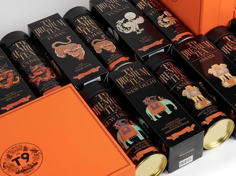
T9 Fruit Tea is mainly designed for business men of Chinese metropolis who love travelling and pursue the quality of life, and the product is developed to meet their needs for daily drinking and gift giving. The packaging chooses carefully the classical symbols of legends from each famous tea localities such as dragon, phoenix and crane of China, elephants of New Delhi, lions of Sri Lanka to inject cultural characteristics and match the positioning of the product line of the legendary selection. Black background with gilt-edged craft demonstrates the sense of luxury of the product. The packaging box with orange leather stripes has very high recognition and also shows a sense of luxury of the gift box. After removing the lining of the delicate packaging box, it can be reused as a storage box in the office.
The Shanghai classic brand ‘Yan Zhong’ has a brand-new product image for its Cherry Blossom Cola this year-‘pure enjoyment’ is the flower language which the designer endows this product packaging with. No redundant expression is needed. Pure and delightful blossom is enough. Flowers tier upon tier shows the vigorous power of life. Pink, pink and white, pink and blue flowers combined with mild texture of pearly-luster ink bring soft and elegant gloss. Part of the flower is transparent so that the light pink liquid inside can be seen. With the refraction, if one raises his head towards the bottle, cherries of different colours are shining and flying in the sunlight. The peaceful scene may heal everyone’s tired but gentle heart.
It is an innovative conceptual package design for jujube juice. According to the consumer research conducted by G&Z Design Office, the public has the stereotype of jujube juice as being “sweet”, “greasy”, “not refreshing” and “seems like what the middle aged Chinese prefer to add on the daily food therapy routine”. On the contrary, tea-based drinks and drinks with refreshing tastes dominate the traffic of consumption in the beverage market. Therefore, on the basis of adding scented tea flavours to the product, the package design aims at breaking the stereotyped image of jujube juice in the shoppers’ mind, and it tends to create a vibe of the product being fresh, relaxing and filled with flower fragrance. By the means of illustration, the product sends a more targeted message that this jujube juice should be more relevant with ladies pursuing healthy lifestyles.
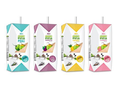
The label idea of Rita comes from Vietnam specialty bamboo hats. Together with the South Asia iconic coconut, Rita is able to express the landmark product to consumers in a clear and direct way. Bamboo hat lies in the middle of the label and the top and bottom of the label also outline the shape and stripes of bamboo hats. The stick figure on the left corner shows the traditional transportation of coconut. The boat, river, bridge, coconut tree and women in red make a beautiful picture with nature fresh, which matches Rita’s position of being natural and healthy. In the selling and marketing process, Rita could also give free a small bamboo hat as a souvenir, to arouse attention of the products’ Vietnam personality and enhance the shopping experience.
Conclusion
No matter how the trend is evolving, good packaging design should always be loyal to the brand. And the trend forecasting is to provide us with different techniques of art expression on the F&B packaging, make sure that brands are connected with the newest era and even enable brands to lead the trend. Fortunately, through Marking Awards, we can see that brands and design agencies are making continuous exploration in this field. Moreover, plenty of cases are proving to us that trends combinations can achieve amazing results. For example, ‘Minimalism that let colour shine’ has been listed as one of the packaging design trends of 2019 by overseas media, while the idea of ‘extreme visual’ can also be stretched to each segmented field. For example, besides bold colouring, using colour to the extreme or magnifying the enjoyment of F&B packaging to the extreme also work. From our side, it is more than a lucky task to continuously analyse, display and report the most recent F&B package design cases appeared in Marking Awards. Furthermore, mass participation from every of you will be definitely welcomed by the entire MA team so we can promote the interaction between food and design with bigger power!