
Domino Printing Science has teamed up with Procter and Gamble to develop a tactile solution for product labelling that aims to help visually impaired consumers distinguish between personal care products during use.
For those living with a visual impairment, simple tasks, like telling the difference between bottles of shampoo and conditioner, can be a real challenge.
Even for consumers with poor or reduced sight, it can be difficult to identify products while in the shower or bath – where sight aids, such as glasses, contact lenses, or magnifiers, are not typically used. These are the issues that P&G and Domino are seeking to find a solution to.
The companies decided that Braille was not going to provide the easy differentiation needed, due to the limited number of Braille users. For example, they say that in the US less than 10% of people with the highest visual impairment - those registered as legally blind - can read the tactile writing system. P&G and Domino therefore sought to develop a more universal alternative.
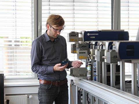
“We were invited to visit Domino’s specialist laser testing labs in Hamburg, initially to discuss the requirements for the project, and then again for a two-day working session to identify the best possible solution,” says Kevin Higgins, an engineer at P&G.
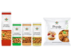
“Together, we chose the Herbal Essences bio:renew range of shampoo and conditioners as a trial product, which could be easily marked by Domino’s D-Series CO2 laser coders to create a differentiating tactile marker.”
Dr. Stefan Stadler, team lead at the Laser Academy, led the collaborative task with the aim of finding the best approach. The team identified the bottom of the bottle, where the plastic is at its thickest, as the best location for the coding, where it would be easily identifiable without compromising the integrity of the packaging.
“The chosen design features a row of raised lines on the bottom of the back of the shampoo bottles — ‘S’ for shampoo, ‘S’ for stripes — with two rows of raised dots in the same place on conditioner bottles — ‘C’ for conditioner, ‘C’ for circles,” Stadler says.
Bottle integrity was an important factor in P&G’s considerations because this outward embodiment of the brand is the first thing the consumer sees and the last thing they touch.
The bottle not only has to look good, but it also has to perform throughout its entire life, so compromising its integrity would not be acceptable.
With the aim of ensuring the new stripes and circles approach would work for consumers, P&G presented the newly-coded Herbal Essences bio:renew bottles to the Royal National Institute of Blind People (RNIB) in the UK for consumer testing.
A follow-up focus group with visually impaired consumers approved of the new inclusive bottle design, with the companies apparently receiving positive reviews from those living with partial or complete sight loss.
Based on the success of the initial trial, P&G rolled out the new inclusive design across all its US range of Herbal Essences bio:renew shampoos and conditioners.
For more news and in-depth commentary on how packaging can connect brands and consumers, visit our sister publication Touchpoints.