During the last few months, we have all seen a host of changes in our professional and personal lives — some for good, others less positive. This unique situation has forced many of us to reappraise our approach to work and our priorities more broadly. Inspired by the opportunity to think and behave differently, Anthem Worldwide's Amsterdam and Brussels team has been exploring how packaging design can be used to help influence positive change across different categories.
This six-part series uses insight and purpose-driven concept design to challenge the status quo, elicit behavioral change, and improve user experience — providing new opportunities for brands to create more meaningful and valuable connections with their consumers. The sixth and final part of the series looks to provide a practical and effective packaging design solution for on-the-go wine, offering a range of beverages inspired by consumers' thirst for experiences over things.
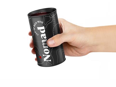
Nomad is a conceptual packaging design for ready to drink and on-the-go single-serve wines.
The concept design was inspired by the need for a more convenient packaging format than the glass bottle; designed to service occasions such as summer picnics, camping excursions, and festivals.
There have been numerous innovations in this space to hit the market in recent years, but the majority still fall a little short. Either cumbersomely trying to emulate the wine glass, or detracting from the ceremonial pleasure of drinking wine by serving in a ring top can, or indeed removing the elegance of the product by adopting craft beer graphic design styles. Of course, this has been done strategically to make wine more fun and less pretentious, but by attracting a small new user group, brands risk alienating a large and well established one.
Nomad wines aims to take advantage of the shedding of negative stereotypes surrounding canned and boxed wines, but in doing so it seeks to evolve the packaging design in aid of providing a better, more fit-for-purpose solution. A packaging design for on-the-go wine that removes all hints of having to sacrifice the pleasure of the traditional wine experience.
Nomad wines are easy to transport, open and use — a structure that serves as a cup, not just a can. Taking the staple aluminium soda can and re-designing the lid provides consumers with a more authentic product and user experience; the wider open surface allows the wine to breathe, as when served in a carafe. The packaging can be opened using the pull and peel back lid to reveal the wine inside, transforming the humble can into a cup for enjoyment anywhere. The can is light and so reduces our carbon footprint through the supply chain, is easy to carry, and fully recyclable for ease of disposal when on-the-go.
Both the brand name and packaging design are influenced by the intended user groups; millennials and Gen Zs with a passion for the outdoors, for exploring and those who value experiences over things. The tag of the lid and compass pointers are colour matched to the wine variant to provide variant navigational cues. The graphic design of a line drawn map and matte finish provides a grown-up and gender-neutral look and feel to attract the adventurer in us all.