During the last few months we have all seen a host of changes in both our professional and personal lives — some for good, others less positive. This unique situation has forced many of us to reappraise our approach to work and our priorities more broadly. Inspired by the opportunity to think and behave differently, Anthem Worldwide's Amsterdam and Brussels team has been exploring how packaging design can be used to help influence positive change across different categories.
This six-part series aims to use insight and purpose-driven concept design to challenge the status quo, elicit behavioural change and improve the user experience — providing new opportunities for brands to create more meaningful and valuable connections with their consumers. Part four in the series uses a unique ingredient packaging design layout to champion the humble bean in support of healthier food snacking alternatives.
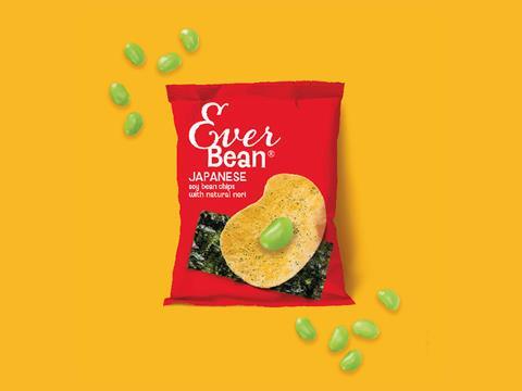
Ever Bean is a conceptual packaging design for bean-based crisps that uses a unique ingredient design layout to challenge category norms.
With the rise in plant-based diets and vegetarian and vegan food trends showing no signs of slowing down, an increasing number of consumers are searching for healthy meat-free snacking options. Whilst both large brands and smaller start-ups have been quick to respond to changing consumer demands in this space, particularly in the ready-meal aisle, there are still relatively few high-protein and on-the-go savoury snack options available in the market.
On top of this, many of the currently available vegetarian and vegan snack brands are already starting to look dated. Though the days of the "homemade chic" health food packaging design are almost behind us, there’s still something almost apologetic about much of the packaging design on-shelf. It’s polite and timid — still leading with nutrition on the pack, over and far above taste; an entirely unnecessary compromise leaving consumers feeling they’ve made something of a sacrifice.
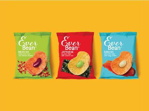
Enter - the humble bean; high in protein, fibre and vitamin B.
The Ever Bean concept design seeks to champion this underrated food group with a new and innovative 2D packaging design layout. Using the crisp and flavour ingredients as a backdrop, the bean is projected forward with pride and in celebration. Somewhat reminiscent of an artist's palette, the unique ingredient arrangement further entices consumers, promising an exciting mix of flavours and great taste. Challenging category norms and encouraging consumers to reappraise the modest bean, this unique design layout is supported by bold, vibrant and lively packaging colours to further secure stand-out on shelf.
Making zero concessions for the modest beginnings of its primary ingredient, Ever Bean concept design heroes the simple bean on-pack and offers a selection of three variants. Each variant takes inspiration from different food cultures around the world, all of which have iconic bean-based dishes embedded in their DNA. The brand name itself ‘Ever Bean’ supports the product purpose — a healthy snack for consumption at any time.

