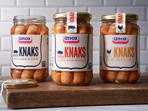
Anthem has created a packaging design for Unilever's Unox – a new range of more premium Knaks. The range includes three variants (natural, lean and chicken) and has been launched in the Netherlands.
The Unox brand is inextricably linked with Dutch cuisine and has been the leading player in the market for over 80 years. A rise in private label comparative offers and a change in market trends required the brand to make a fresh offering in the market.
In order to encourage millennials to reappraise the brand, Anthem needed to effectively communicate the craftsmanship, honesty and authenticity of the products. The strategy behind the design was to go back to the brand's roots – to reinject the packaging design with the brands quality butcher’s heritage, a recipe unchanged since 1937, and to leverage this as an emotional proposition through design.
Anthem says it also wanted to amplify the more premium packaging of glass jars by presenting a more grown-up look and feel to the range, allowing the brand to appeal to new user groups. it says the packaging design communicates the honest craftmanship of a traditional butcher in a modern way.
“It was really important for us not to alienate existing users, while finding a way to evolve the brands packaging design aligned to changing consumer desires – designing modern heritage is a delicate balancing act. This is especially true when dealing with an icon brand such as Unox. Playing on the butcher’s heritage of the brand afforded us ability to maintain the strong emotional connections while offering a new more premium experience.”
Sara Jones – Design Director


