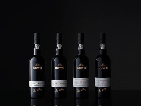
Historic Port brand Dow’s is relaunching its range of Aged Tawnies in a bid to attract a younger audience, with elegant, refined packaging design by Denomination.
Dow’s, owned by the Symington Family, holds one of the largest and most valuable stocks of Port ageing in seasoned oak, including barrels that date back to the 19th century. Master blender Charles Symington has used these beautifully mature wines to redefine Dow’s 10-, 20-, 30- and 40-year-old Ports.
To present the wine, Dow’s wanted a contemporary, luxurious look befitting of a Wine Spectator award-winning brand. The new packaging needed to communicate its place in the premium on-trade market and feel relevant to consumers in off-trade. Dow’s also wanted to broaden its appeal to a younger audience and extend the occasion for Port beyond Christmas and formal occasions.
World-wide sales of Aged-Tawny Ports are valued at over €77 million and have grown by an astonishing €21 million since 2010 (+38%)*, belying the myth that today’s consumers are less interested in Port.
In order to capitalise on the award-winning pedigree of Dow’s Vintage Ports, Denomination created a clear connection between the Vintage and Aged Tawny variants by using the elegant and more contemporary Dow’s Vintage black glass across both. The previously ‘quiet’ W.DOW triangular brand asset has also been elevated, giving the range added stand-out and all-important instant recognition. This refashioned marque now ‘pulls away’ from the rest of the elements on pack, increasing its significance and making it more recognisable. Triangular-shaped gift boxes, used to present each Aged Tawny, also contribute to the amplification and ownership of this iconic brand asset.
Negative tension between Dow’s logo, which is hot-foiled on glass at the shoulder of the bottle, and the label towards the base, increases the modernity and uniqueness of the packaging. The front label now highlights the provenance of the grapes and features the name of the range’s maker, master blender Charles Symington.
The addition of progressive quality cues, both graphically and through the use of copy, serve to differentiate the four ages of Port (10-, 20-, 30- and 40-years-old) and communicate the varying price points. The 40-year-old tawny Port label, for example, has subtle bevelling and intricate embossed filigree to elevate it.
The provenance of the drink appears on the stopper, the centre of the bottle and on the label, highlighting its Portuguese origins. And Douro Valley, where the grapes are grown and the Port is made, features on the front label. Embossing and debossing on the labelling add to the luxury feel of the product. And the handwritten signature of founder James R. Dow below the label further communicates heritage and craftsmanship.
Rowena Curlewis, CEO, Denomination, says: “A terrific amount of craftsmanship goes into creating Dow’s range of Ports, but consumers in the UK often see Port as old-fashioned and only for formal or festive occasions.
“We wanted to create a design that would achieve stand-out, make Port appeal to a wider audience all year round, and give Dow’s a clear and defined presence in the market by amplifying its distinctive assets, while retaining the prestige and classic cues of this esteemed brand.
“This new look will encourage consumers to see the product differently and will also help to redefine the category. To help Dow’s move away from the traditional British associations with Port, we rooted the product firmly in Portugal – surely the ultimate in cool for holiday destinations currently.”
Paul Symington, Chairman, Symington Family Estates, adds: “We have a beautiful new presentation that transmits the supreme quality of these rare hand-crafted Ports. This is a design that is both innovative and contemporary and builds on Port’s fantastic heritage and traditional visual cues. My family and I are delighted with how Dow’s classic image and heritage have been brought together in this original visual approach by Denomination.”


